| Image |
Comment |
| 04/27/2004 02:04:16 PM |
|
 Photographer found comment helpful. Photographer found comment helpful. |
| 04/27/2004 01:25:07 PM |
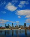
CiTyScApEby mariomelComment by heida: Looks like the city is falling :-) Nice blue color and reflection, dramatic sky |
| Photographer found comment helpful. |
| 04/27/2004 11:46:15 AM |
|
| 04/27/2004 06:30:08 AM |
CiTyScApEby mariomelComment by redmoon: From (painfull) experience, it appears that photos with a large percentage of sky for some reason often doesn't do well. Well, those voters are wrong darn it to heck - a good dramatic sky always works for me, and this is a case in point. The sky here is gorgeous. Unfortunately, it appears that something has gone a bit awry with some of the buildings away from the centre, which in turn gives the impression of a wonky shot. In certain post processing software this effect could be minimised a little by distorting the image (using free transform in PS). Still, it's certainly an attractive skyline. |
| Photographer found comment helpful. |
| 04/27/2004 01:59:02 AM |
CiTyScApEby mariomelComment by HRoxas: Nice colours and well-composed. I like the use of reflections. A few things that can be improved: 1. Perspective correction to straighten the buildings. 2. Rotate your image CW to level the horizon. 3. Seems a little over-sharpened... there are halos around the buildings. |
| Photographer found comment helpful. |
| 04/26/2004 07:19:04 PM |
CiTyScApEby mariomelComment by photom: Very nice composition and use of the image space. Colors very pleasing and saturated. Looks like there is a small keystoning effect which is unfortunate. |
| Photographer found comment helpful. |
| 04/26/2004 07:02:59 PM |
CiTyScApEby mariomelComment by Neil: Nice but seems distorted--the right side is tilted relative to the left! |
| Photographer found comment helpful. |
| 04/26/2004 05:29:40 PM |
|
| Photographer found comment helpful. |
| 04/26/2004 03:38:37 PM |
CiTyScApEby mariomelComment by jodiecoston: Lovely photograph and good use of the wide-angle lens to bring out that sky and add depth. I find it disturbing to my eyes that the "vertical center" seems to not be in the actual center of the photograph, but in line with the taller middle building, making the right side of the image "lean in" more than the left. |
| Photographer found comment helpful. |
| 04/26/2004 01:52:28 PM |
|
| Photographer found comment helpful. |
Home -
Challenges -
Community -
League -
Photos -
Cameras -
Lenses -
Learn -
Help -
Terms of Use -
Privacy -
Top ^
DPChallenge, and website content and design, Copyright © 2001-2026 Challenging Technologies, LLC.
All digital photo copyrights belong to the photographers and may not be used without permission.
Current Server Time: 06/18/2026 12:18:29 AM EDT.