| Image |
Comment |
| 10/04/2006 09:40:45 AM |
|
| 10/04/2006 05:40:51 AM |
|
| 10/04/2006 12:44:20 AM |
|
| 10/03/2006 07:50:14 PM |
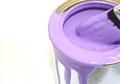
Paintingby Kimberly75Comment by Nuzzer: This is a really nice photo. The bad thing (for the challenge) is that it is "nice" and not "wow'. I think if you could have made the purple a more vivid shade that would help a lot. Currently it has a pastel feel to it.
The composition is good and the brush adds a nice element of interest to draw the eye in. |
| 10/03/2006 05:10:33 PM |
|
| 10/03/2006 11:23:37 AM |
Paintingby Kimberly75Comment by quik5i1ver: Simple but effective, not sure on the focus, I think clearer focus around the top of the tin would be good.. |
| 10/01/2006 11:00:19 AM |
Paintingby Kimberly75Comment by Greebo: I like this shot. I just feel as if there is a little too much empty space on the left. It kinda draws my eye. But very nice. |
| 10/01/2006 07:29:04 AM |
Paintingby Kimberly75Comment by SergeP: Would have loved a contrasting background... yellow, green, something other than black... |
| 09/28/2006 11:59:48 PM |
|
| 09/28/2006 09:39:21 PM |
|
Home -
Challenges -
Community -
League -
Photos -
Cameras -
Lenses -
Learn -
Help -
Terms of Use -
Privacy -
Top ^
DPChallenge, and website content and design, Copyright © 2001-2026 Challenging Technologies, LLC.
All digital photo copyrights belong to the photographers and may not be used without permission.
Current Server Time: 07/15/2026 04:37:48 PM EDT.