| Author | Thread |
Comments Made During the Challenge  |
|
|
10/03/2006 07:50:14 PM |
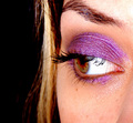
This is a really nice photo. The bad thing (for the challenge) is that it is "nice" and not "wow'. I think if you could have made the purple a more vivid shade that would help a lot. Currently it has a pastel feel to it.
The composition is good and the brush adds a nice element of interest to draw the eye in. |
|
|
|
10/03/2006 05:10:33 PM |
|
|
|
10/03/2006 11:23:37 AM |
|
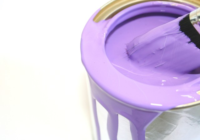
Simple but effective, not sure on the focus, I think clearer focus around the top of the tin would be good.. |
|
|
|
10/01/2006 11:00:19 AM |
|
I like this shot. I just feel as if there is a little too much empty space on the left. It kinda draws my eye. But very nice. |
|
|
|
10/01/2006 07:29:04 AM |
|
Would have loved a contrasting background... yellow, green, something other than black... |
|
|
|
09/28/2006 11:59:48 PM |
|
Can I have this for my guest badroom? ;);) nice idea!! |
|
|
|
09/28/2006 09:39:21 PM |
|
IMO needs a little less white space on the left, but i like the color and the idea |
|
|
|
09/28/2006 05:58:12 PM |
|
I love the concept, but find myself wishing for more texture. I want the purple to JUMP OUT at me. |
|
|
|
09/28/2006 09:03:12 AM |
|
I really like this one - this is a shot that I would hang on my wall - |
|
|
|
09/28/2006 02:23:00 AM |
|
Very nice, and really suits the challenge..... |
|
|
|
09/27/2006 09:09:10 AM |
|
nice idea - I like the "juicy" look of the paint. The focus looks a little soft in areas - like the front lid. I might have like it sharp as a tack throughout to see those glossy reflections better. Still, good work. |
|
|
|
09/27/2006 07:18:07 AM |
|
A swipe of paint in the white space at the left would make this really spectacular. It's good as it is, though. |
|
|
|
09/27/2006 05:41:38 AM |
|
a bit too pale for purple, cropped too tightly, composition is unbalanced IMO |
|
|
|
09/27/2006 02:36:13 AM |
|
Home -
Challenges -
Community -
League -
Photos -
Cameras -
Lenses -
Learn -
Help -
Terms of Use -
Privacy -
Top ^
DPChallenge, and website content and design, Copyright © 2001-2026 Challenging Technologies, LLC.
All digital photo copyrights belong to the photographers and may not be used without permission.
Current Server Time: 07/01/2026 03:16:31 AM EDT.