| Image |
Comment |
| 08/18/2008 01:36:10 PM |
|
 Photographer found comment helpful. Photographer found comment helpful. |
| 08/12/2008 10:10:27 PM |
|
| Photographer found comment helpful. |
| 08/10/2008 03:44:58 AM |
One Snap Shot, One Trip Shotby 777STANComment by klstover: Oh! How cute! The photographer as the fallen one instead of the subject! Well the challenge didn't say "portray a fallen subject" did it? LOL, very awesome. |
| Photographer found comment helpful. |
| 08/10/2008 02:22:29 AM |
|
| Photographer found comment helpful. |
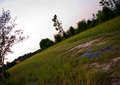
| 08/06/2008 12:44:46 AM |
The Last Hill of The Dayby 777STANComment by Yo_Spiff: Hiking? A bit backlit but not much glow in the sky yet. There's a lot of interest in this scene, but it's not jumping out at me either. I dunno. |
| Photographer found comment helpful. |
| 08/05/2008 09:28:14 PM |
One Snap Shot, One Trip Shotby 777STANComment by DarkRider: I looked long and hard for a reason to give this photo a good vote. Sorry I can't find one. If you would like an honest critique on this pic please PM me. Best of luck. Scott |
| Photographer found comment helpful. |
| 08/05/2008 04:39:40 PM |
HOT by Definition!by 777STANComment by karmat: CRITIQUE CLUB CRITIQUE
bykarmat
Compositionally, this shot doesn't feel really balanced. At the bottom, the numerals are "straight," but then the top of the sign is "tilted." That is just a bit disconcerting, I think. For whatever reason, I'm thinking having more of the bricks would help add context and interest (and color) to the shot.
Technically, the focus, lighting and contrast is good. It does seem a bit "flat" but a lot of times that happens when shooting signs with no surrounding area around them. Also, as has been mentioned, cutting half a logo out is always an attention getter.
Best to you in future challenges.
Karma |
| Photographer found comment helpful. |
| 08/05/2008 04:11:41 PM |
|
| Photographer found comment helpful. |
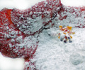
| 07/30/2008 06:33:29 PM |
Confectioner's Flowerby 777STANComment by ambaker: Critique Club Review:
Color Saturation and Hue: Colors are OK, saturation is good, and hues are realistic.
Brightness and contrast: Brightness and contrast are done well. The sugar holds detail, and contrast does not appear too high or too low.
Focus and depth of field: Focus is nice and sharp. Depth of field feels a bit shallow, as the larger clump of sugar goes soft in the foreground.
With the white sugar on the red flower, the flower petals tend to blend into the featurless background. A different color background would have helped here.
I'm not quite sure what this is. The moisture on the flower makes the sugar turn into globs, which in turn makes the petals look thick, heavy, and somewhat distorted. Brown areas on the upper left of the flower also distract a bit. Perhaps a lighter dusting of sugar on the flower flower, and the photo taken from a little greater distance, would have helped. Or perhaps a fine crystal sugar to give it more of a jewel effect.
The idea is a good one, I'd really like to see it done again. |
| Photographer found comment helpful. |
| 07/29/2008 09:35:35 PM |
HOT by Definition!by 777STANComment by DarkRider: OK this photo really does not have a lot going for it. First it is really flat. The banks flower logo is cut in half, the bricks on the bottom right really don't add anything to the capture. Its been taken from a slight angle but not significant enough to look intentional or purposeful. And the crop isn't centered. True that the sign reads 99degs and that's hot, but this pic just isn't. This was my lowest rated photo for the hot challenge "4" because it is in focus and hot can be seen in the photo without having to read the title. If you where going for Brown or trying to sabotage your score for the better then average side challenge you have succeeded. If not and you have questions or comments please PM me. Scott |
| Photographer found comment helpful. |
Home -
Challenges -
Community -
League -
Photos -
Cameras -
Lenses -
Learn -
Help -
Terms of Use -
Privacy -
Top ^
DPChallenge, and website content and design, Copyright © 2001-2026 Challenging Technologies, LLC.
All digital photo copyrights belong to the photographers and may not be used without permission.
Current Server Time: 07/19/2026 08:17:41 AM EDT.