| Image |
Comment |
| 05/18/2007 09:55:21 PM |
|
 Photographer found comment helpful. Photographer found comment helpful. |
| 05/18/2007 10:50:07 AM |
|
| Photographer found comment helpful. |
| 05/17/2007 01:20:25 PM |
|
| Photographer found comment helpful. |
| 05/17/2007 11:24:06 AM |
|
| Photographer found comment helpful. |
| 05/16/2007 12:06:10 PM |
|
| Photographer found comment helpful. |
| 05/13/2007 09:56:42 PM |
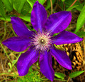
Clematis: Symmetry 2X Concentricby 777STANComment by sfalice: Greetings from the Critique Club
Lovely clematis. You found one in great shape and photographed it well. I will say it is pretty well saturated, and I sure wouldn't want to see it any more saturated.
:-))
But I will suggest that the depth of field might have been a little more shallow to afford more background blurring. The twigs and greenery behind the beautiful flower are a distraction, but had they been blurred out a bit, they would have offered a nice, colorful foil to the flower. Of course, that's just my take on it...
You have a nice image here, one that I'm pleased to have had the opportunity to look at more closely.
|
| Photographer found comment helpful. |
| 05/07/2007 12:55:50 PM |
Honeysuckle Bloomsby 777STANComment by karmat: CRITIQUE CLUB CRITIQUE
by karmat
Overall, this is a very interesting effect you have achieved here. I like the little parts of bright color and I think it really helps to bring out the orange tones of the flowers. My first though was to go completely black and white in the background, but the more I think of that, the less I think I would like it. What I do think is distracting is that the shot emphasized in color on the left and right are not in focus. In a "regular" shot, this would not be an issue, the eyes would simply seek out that which was focused. Here, though, they drift to the colored parts, and 2/3 of them are out of focus, so it kind of takes away from the rest of the shot.
I think the shot is a bit busy, as well. Perhaps if you could have isolated the blooms a bit more without so much in the background it might have helped to define your subject a bit more clearly.
Again, I like the shot, and I was actually one of the higher voters on it. I think you had a great idea, and it could be a truly effective eye pleasing shot if just a couple of minor things were different.
If I need to clarify or explain myself further, please feel free to contact me.
Karma |
| Photographer found comment helpful. |
| 05/07/2007 09:23:42 AM |
|
| Photographer found comment helpful. |
| 05/06/2007 11:35:47 PM |
|
| Photographer found comment helpful. |
| 05/06/2007 03:46:59 AM |
Honeysuckle Bloomsby 777STANComment by levyj413: I think this is too many boundaries. Maybe it'd work better without the vertical lines? I like the selectively edited sections and how they climb up to the right. |
| Photographer found comment helpful. |
Home -
Challenges -
Community -
League -
Photos -
Cameras -
Lenses -
Learn -
Help -
Terms of Use -
Privacy -
Top ^
DPChallenge, and website content and design, Copyright © 2001-2026 Challenging Technologies, LLC.
All digital photo copyrights belong to the photographers and may not be used without permission.
Current Server Time: 07/24/2026 10:17:53 AM EDT.