| Image |
Comment |
| 11/16/2007 02:37:46 PM |
|
 Photographer found comment helpful. Photographer found comment helpful. |
| 11/15/2007 03:52:12 PM |
|
| Photographer found comment helpful. |
| 11/13/2007 10:00:12 AM |
|
| Photographer found comment helpful. |
| 11/12/2007 10:47:52 PM |
|
| Photographer found comment helpful. |
| 11/11/2007 06:02:42 PM |
|
| Photographer found comment helpful. |
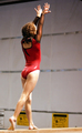
| 11/10/2007 02:03:56 AM |
From the Movie: "Stick It!"by 777STANComment by Man_Called_Horse: Three things.
This would of been a better pix if I could of seen her expression on her face instead of her back side.
This would of been a better pix if it were sharp out of the camera.
This would of been a better pix if the black lines on the wall were not cutting through your model. |
| Photographer found comment helpful. |
| 11/09/2007 11:08:10 AM |
|
| Photographer found comment helpful. |
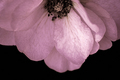
| 11/09/2007 12:48:19 AM |
The Bloom Expands...by 777STANComment by geoffb: Hi from the Critique Club,
Second time I got one of your images in the same day!
I was a bit surprised at first to see that this image scored so low. However, considering the challenge it was entered in, I'm presuming that a lot of voters voted it down because they figured it did not meet the challenge. Your explanation above hints at your intention, but one might instead argue that the rose in full bloom is at the peak of its beauty.
With that said, you've done a great job of capturing a beautiful flower. The water droplets are certainly favourable, and you've done a great job of keeping all aspects of the image well exposed.
The tight crop is nice to see detail, but I might have suggested either a tighter crop or more negative green space around the flower. There is a bit of fringing around the edge of the flower, which seems to indicate either oversharpening or aberration. Some might like that fringe, and others might not have noticed. It's only a small nitpick that I wouldn't have voted down on in this case.
You've captured a nice subject; perhaps the voters would have liked a different or more interesting (i.e. better bokeh) background.
Regards,
Geoff |
| Photographer found comment helpful. |
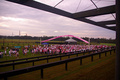
| 11/08/2007 09:50:37 PM |
"Many Gather to Race For The Cure"by 777STANComment by geoffb: Hi from the Critique Club,
First of all, I have to agree that you've photographed a great cause here. This is definitely along the lines of the type of image one would expect to see in a newspaper. In a journalistic way, you've captured the mood and substance of the event without identifying anyone that was there; sometimes a facial expression really works, but in this case a nice wide angle works well.
As was mentioned, there is a slight red colour cast to the image (confirmed in Photoshop). This is something that could have been fixed in-camera, since this image doesn't rely too much on timing (I'm assuming you probably could have taken an image very similar to this over the course of at least 5 or 10 minutes). Despite this, you've done a great job of exposing this image; the sky looks great, and there's nothing blown or overly dark.
Agreed, a panorama would probably look much better. Based on the editing circumstances, however, you've done a great job of capturing the moment.
Regards,
Geoff |
| Photographer found comment helpful. |
| 11/06/2007 07:05:53 PM |
|
| Photographer found comment helpful. |
Home -
Challenges -
Community -
League -
Photos -
Cameras -
Lenses -
Learn -
Help -
Terms of Use -
Privacy -
Top ^
DPChallenge, and website content and design, Copyright © 2001-2026 Challenging Technologies, LLC.
All digital photo copyrights belong to the photographers and may not be used without permission.
Current Server Time: 07/24/2026 07:14:56 PM EDT.