| Image |
Comment |
| 01/14/2006 04:03:28 PM |
|
| 01/14/2006 08:52:13 AM |
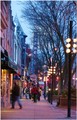
State Streetby ElmakiasComment by Jutilda: When I see this pop up on the comments page, I can't help but think it's reminiscent of a street scene painting. I like the colors and the activity. I had given it a 7 in the challenge, but failed to comment. If I were to critique anything it might be to straighten the tilt of it a bit, and maybe up the color saturation ever so much. |
 Photographer found comment helpful. Photographer found comment helpful. |
| 01/14/2006 07:23:08 AM |
|
| Photographer found comment helpful. |
| 01/14/2006 04:34:55 AM |
|
| 01/13/2006 12:44:54 PM |
State Streetby ElmakiasComment by ladyhawk22: Hello from the Critique Club!
Nice image of a downtown area! In particular, I like the blurred figure in the foreground--it shows the motion and business of the area. The number of people in the shot also speak to the traffic in this area, which comes off very well for the City Life challenge. The colors in this photo are very good and true to life, for the most part. In the upper left hand portion of the photo, the sky seems to be a bit bright, washing out some of the colors there. Composition of the photo looks pretty good--you've managed to get the movement of the people as well as a small part of the storefronts. I would be curious to see the result if the shot were angle a little more from the right, which would include a bit more of the storefronts and the interesting signs there. I believe also that a slight rotation of the photo might make this more appealing to the eyes of viewers. The sign of the Orpheum, as well as the street lights on the right, lean (ever so slightly) to the right. This can be a hard thing to account for through the camera, as it looks like your horizon is lined up pretty well. Good action and interest in this photo. I feel like I've been to Madison now :-) |
| Photographer found comment helpful. |
| 01/13/2006 01:10:36 AM |
Leftoversby ElmakiasComment by C-town driver: Nice composition and textures in this shot. However, it seems the WB or color saturation is a tad off IMHO. |
| Photographer found comment helpful. |
| 01/12/2006 11:29:13 AM |
|
| Photographer found comment helpful. |
| 01/12/2006 05:39:43 AM |
|
| Photographer found comment helpful. |
| 01/10/2006 04:54:28 PM |
Leftoversby ElmakiasComment by Melethia: The leaves are kind of "busy" - it may have been better to use a shallower depth of field to get part of the pumpkin sharp and let the leaves blur a little. |
| Photographer found comment helpful. |
| 01/10/2006 01:01:15 PM |
State Streetby ElmakiasComment by KHolt: A slight rotate would have added a bit to this photo, instead of making it look more like a snapshot |
| Photographer found comment helpful. |
Home -
Challenges -
Community -
League -
Photos -
Cameras -
Lenses -
Learn -
Help -
Terms of Use -
Privacy -
Top ^
DPChallenge, and website content and design, Copyright © 2001-2026 Challenging Technologies, LLC.
All digital photo copyrights belong to the photographers and may not be used without permission.
Current Server Time: 07/19/2026 03:38:28 PM EDT.