| Image |
Comment |
| 05/14/2006 03:02:03 AM |
Faithby NigelComment by bfox2: This is a great shot, the muted tone and color really do a good job of emphasizing the details. I think the amount of contrast fits well. |
 Photographer found comment helpful. Photographer found comment helpful. |
| 05/14/2006 02:58:48 AM |
Just Charleyby NigelComment by bfox2: I think this shot is good, as it looks really sharp, but the lack of contrast disguises this. Some levels or curves would make this really stellar. |
| Photographer found comment helpful. |
| 05/14/2006 02:57:33 AM |
A Bitter End - Murdered!!!by NigelComment by bfox2: Great creativity, and the lighting here seems perfect for the shot, I love the way it outlines the knife really well and brings the eye down to the lemon. |
| Photographer found comment helpful. |
| 05/14/2006 02:55:41 AM |
|
| Photographer found comment helpful. |
| 05/14/2006 02:53:42 AM |
Owletby NigelComment by bfox2: I'd agree with a couple of the comments that you might want to do a little bit of contrast and also a little color adjustment (it seems a bit too 'red' overall) but otherwise an excellent capture! That expression is priceless. |
| Photographer found comment helpful. |
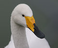
| 05/14/2006 02:51:38 AM |
Swanby NigelComment by bfox2: I like the composition of this shot, the head/beak is really well positioned in the frame. You've also captured really good deatil. To me though it looks just a little underexposed. on the head and neck. You could try dodging to make it a little lighter, or isolating the head and neck on a seperate layer and brightening it up with levels/curves. I think that would really help this image 'pop', giving it a lot more impact. |
| Photographer found comment helpful. |
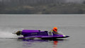
| 05/14/2006 02:48:18 AM |
Speedboat-1by NigelComment by bfox2: I like the colors in this shot, and I think you could really post the impact with some post processing. I suspect that it was a cloudy day, which left the water and background a little bland, but if you edited these on a seperate layer you could brighted them up selectivly to add interest, or do something like putting in motion blur. You could also try cropping a little bit off the left side to get the boat from being quite so centered. |
| Photographer found comment helpful. |
| 05/14/2006 02:45:58 AM |
|
| Photographer found comment helpful. |
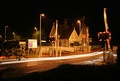
| 05/11/2006 07:31:00 PM |
Crossingby NigelComment by scotthadl: I would have voted this higher if you had been closer to the house and made that your primary subject with just small amount of light trials. |
| Photographer found comment helpful. |
| 05/10/2006 01:03:03 AM |
|
| Photographer found comment helpful. |
Home -
Challenges -
Community -
League -
Photos -
Cameras -
Lenses -
Learn -
Help -
Terms of Use -
Privacy -
Top ^
DPChallenge, and website content and design, Copyright © 2001-2026 Challenging Technologies, LLC.
All digital photo copyrights belong to the photographers and may not be used without permission.
Current Server Time: 07/16/2026 06:05:30 AM EDT.