| Image |
Comment |
| 01/23/2006 01:33:52 AM |
|
 Photographer found comment helpful. Photographer found comment helpful. |
| 01/22/2006 01:20:23 PM |
|
| Photographer found comment helpful. |
| 01/22/2006 03:28:21 AM |
|
| Photographer found comment helpful. |
| 01/21/2006 11:57:42 PM |
|
| Photographer found comment helpful. |
| 01/21/2006 04:51:51 PM |
|
| Photographer found comment helpful. |
| 01/21/2006 02:37:18 PM |
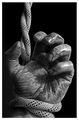
Signs of a Struggleby front_elementComment by fotomann_forever: Nice! Well done... THE most creative I've seen so far in this challenge! I gave it a 10. I read your forum post in the forum... so I'll answer you really quickly.
The choice to add a border should be on whether it adds to the image. Some images don't work well directly butted up against the neutral grey bg. Yours would have done well against the neutral grey, so the frame doesn't add much for you. But, it certainly doesn't detract from the image, other than you have lost that many pixels in which you could have shown just a little more detail.
Hope that helps. |
| Photographer found comment helpful. |
| 01/21/2006 02:33:28 PM |
Signs of a Struggleby front_elementComment by L1: It's not good form to link to your picture from the forums during voting. I'm sure that will probably render you some criticism and some scores that don't reflect the image itself. That said, it's a nice photo with lots of tonal range and great clarity. The border doesn't bother me at all, either. Good luck in the challenge. |
| Photographer found comment helpful. |
| 01/21/2006 02:14:26 PM |
Signs of a Struggleby front_elementComment by Pensive: An excellent photograph, but the white border detracts from the image as it hints at something missing. I think it would have been much more powerful without the border - but I still easily got the sign without looking at the title. Take a look at "Mark of Death " and then try looking at your image both ways with fresh eyes. |
| Photographer found comment helpful. |
| 01/21/2006 11:17:55 AM |
|
| Photographer found comment helpful. |
| 01/20/2006 09:20:27 PM |
Signs of a Struggleby front_elementComment by Gatorguy: Great hand - terrific texture and color treatment. If I had a criticism, it would be that the rope isn't as grizzled looking as the hand. That would have pushed this to 10. 8 |
| Photographer found comment helpful. |
Home -
Challenges -
Community -
League -
Photos -
Cameras -
Lenses -
Learn -
Help -
Terms of Use -
Privacy -
Top ^
DPChallenge, and website content and design, Copyright © 2001-2026 Challenging Technologies, LLC.
All digital photo copyrights belong to the photographers and may not be used without permission.
Current Server Time: 04/02/2026 02:08:37 AM EDT.