| Image |
Comment |
| 06/06/2006 06:11:38 PM |
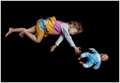
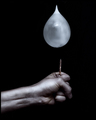
No gravityby DjabordjaborComment by Arti-Elvi: Awesome. It makes me a little sad at the same time. I don't know why. Perhaps because the girl looks unhappy. I like the negative space around the girl and the doll. Added to favorites. |
 Photographer found comment helpful. Photographer found comment helpful. |
| 06/06/2006 03:09:11 PM |
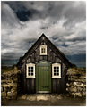
The Pastby DjabordjaborComment by Bear_Music: *** C R I T I Q U E C L U B C O M M E N T ***
Hahaha! How fitting is this? I get to critique an image of the "monster" I enabled just a couple weeks ago!
This is an excellent image, one which I scored very high; and of course it just missed ribboning as well. So clearly you hit the mark here. Why did it do so well? Because it's moody, it "involves" the viewer in a tangible way, for one thing. Additionally, there's a fairytale quirkiness to the structure itself that is guaranteed to please people: based on the scale of the door, it's so TINY a structure, and it's like it's built INTO the ground, it just sings out loud of trolls and elves, hobbits and such. Very effective.
Nevertheless there's room for improvement. In pursuit of your "powerful" post processing, you've allowed the dark areas between stone and facade to block up a bit too much; it would be stronger with a tad more detail there. Also, there's a slight but distinct haloing between sky & roof, especially at the very top.
I've taken the liberty of doing a very quick & rough edit to show you what I'm talking about. let me know what you think :-)

Robt. |
| Photographer found comment helpful. |
| 06/06/2006 02:30:55 PM |
No gravityby DjabordjaborComment by LERtastic: There are two very obvious seperate entities here, and no room visible. This definately DNMC. Thinking outside the box does count for something... but only to a certain extent. I give this a 4 because it is a good shot. |
| Photographer found comment helpful. |
| 06/06/2006 01:25:51 PM |
|
| Photographer found comment helpful. |
| 06/06/2006 08:24:38 AM |
No gravityby DjabordjaborComment by Nigel: Nice photo but IMO the black background doesn't do a very good job of portraying an empty room. |
| Photographer found comment helpful. |
| 06/06/2006 06:42:21 AM |
No gravityby DjabordjaborComment by Skip: ok, i'll say it: DNMC! take ONE thing into an empty room. here you have two things, and no sense of a "room". it's a nice shot, but lucky for you, i'm only commenting and not voting ;-) |
| Photographer found comment helpful. |
| 06/06/2006 06:02:05 AM |
|
| Photographer found comment helpful. |
| 06/06/2006 04:57:43 AM |
|
| Photographer found comment helpful. |
| 06/06/2006 04:46:52 AM |
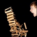
Just one piece...by DjabordjaborComment by Mambe: From the Critique Club :
Hi Magnús !
Congrats ! This was your personal best and still is (for the moment...) your personal best place.
I agree with you about the look , I prefer the funny one of your self portrait ;-)
I really like the lighting on the wood pieces and the crop of the composition.The falling tower fills very well the space , with the lighting and sharpness it's really powerful !
As Larus ,pineapple and ericwoo pointed out in their comments during the challenge , I think that you could have improved it including a hand placing a piece or near the head. By the way , did you take some photos (without destroying the tower) to see different head's effects ? It could have helped.
It was a great idea and you have done an excellent job as reflected in the score. Well done !
Just a question of time to see you ribbonned ! |
| Photographer found comment helpful. |
| 06/06/2006 01:40:57 AM |
|
| Photographer found comment helpful. |
Home -
Challenges -
Community -
League -
Photos -
Cameras -
Lenses -
Learn -
Help -
Terms of Use -
Privacy -
Top ^
DPChallenge, and website content and design, Copyright © 2001-2026 Challenging Technologies, LLC.
All digital photo copyrights belong to the photographers and may not be used without permission.
Current Server Time: 07/17/2026 02:44:21 PM EDT.