| Image |
Comment |
| 01/19/2006 04:57:36 AM |
Sun Siloetteby BethraComment by Skip: sorry, but this is just a bad image. if your subject had been doing something (like raising his arms), there might have been more interest. as is, it's like a bad snapshot. keep on working at it, though, and you'll get where you want to be--just don't quit! |
 Photographer found comment helpful. Photographer found comment helpful. |
| 01/18/2006 01:02:46 AM |
|
| Photographer found comment helpful. |
| 01/15/2006 05:51:36 PM |
|
| Photographer found comment helpful. |
| 01/15/2006 04:44:58 AM |
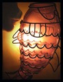
Biting off more than he can chewby BethraComment by ddng: I'm finding this quite hard to comment on! I like the backlighting and it def. meets the challenge.
I find the content interesting but partly because I have no idea of what it is and i just keep staring at it trying to figure it out! I'm assuming it is a cat and a vase?
What I would have like to have seen was a bit more detail on the 'cat'. |
| Photographer found comment helpful. |
| 01/14/2006 09:55:50 PM |
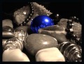
Out of the Blueby BethraComment by ShotMD: Nice selective desat... you can, unfortunatly see your reflection, but that is sometimes hard to mask. I like how you have filled the frame... Cropping in nice and tight. |
| Photographer found comment helpful. |
| 01/14/2006 08:31:36 AM |
|
| Photographer found comment helpful. |
| 01/14/2006 01:07:14 AM |
Out of the Blueby BethraComment by C-town driver: Nice use of selective desaturation to answer the challenge. The tonality of the shot and black areas really give the subject nice contrast. One thing I found distracting was the reflection of the photographer in the sphere. Not sure if this was intentional? If not, perhaps layer masks in p-shop may have helped. |
| Photographer found comment helpful. |
| 01/13/2006 09:54:38 PM |
|
| Photographer found comment helpful. |
| 01/12/2006 06:02:27 AM |
|
| Photographer found comment helpful. |
| 01/11/2006 10:11:00 AM |
Biting off more than he can chewby BethraComment by ecto: The cat shouldn't be there imo, it just distracts from the "fish", which I think should have been smaller (and not cropped) so it would have been easier to see the shape of it. Funny title. |
Home -
Challenges -
Community -
League -
Photos -
Cameras -
Lenses -
Learn -
Help -
Terms of Use -
Privacy -
Top ^
DPChallenge, and website content and design, Copyright © 2001-2026 Challenging Technologies, LLC.
All digital photo copyrights belong to the photographers and may not be used without permission.
Current Server Time: 07/16/2026 10:56:39 AM EDT.