| Image |
Comment |
| 12/20/2002 06:43:16 AM |
|
| 12/17/2002 04:37:14 PM |
Where My Fingers Workby JamieWillmottComment by Slimharpo: c,mon u can do better than this you knew there would be 10, 000 keyboards this week look at my photo, "I bet you didnt know he worked from new zealand" its different new noone else did it |
| 12/17/2002 12:54:30 PM |
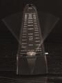
The Flow Of Timeby JamieWillmottComment by andrewm: The Critique Club
The clarity of your focus is very good and your exposure is good, in that it emphasises the details of the metronome with a dark background and captures some of the grain in the wood. My monitor shows a slight warm cast to this image rather than pure black and white but this could just be my settings. You have captured well the swing of the arm with a faint streak from side to side and more pronounced at the ends of the swing. Movement captured-and contrasted with the stillness of the machine. There seem to be no digital artefacts and the picture is pretty grain free.
My only quibble is the composition of your shot. I think if you are trying to be symmetrical you must be exactly symmetrical and if you are to be off centre then you must be totally off centre. Your shot confuses the viewer who doesn’t know whether it is a symmetrical shot gone wrong or what! I also feel you should have experimented with other views. Often just changing the angle to something unexpected can do wonders and invigorate the picture. You chose a straight on view that one would see normally so there are no surprises—how about from above or a very side angle—I think you should have experimented with this.
Andrew
|
 Photographer found comment helpful. Photographer found comment helpful. |
| 12/16/2002 03:31:41 PM |
|
| 12/16/2002 11:15:09 AM |
|
| 12/16/2002 12:38:43 AM |
|
| 12/15/2002 04:55:30 PM |
|
| 12/12/2002 04:03:26 PM |
Bubblesby JamieWillmottComment by timj351: I thought this was a pretty cool photo and I gave you an 8 on it. I'm getting more and more into abstract photos and I can appreciate the simplicity and interesting details of this photo. I feel it can use some improvement, however. It looks like it wasn't real sharp to begin with and you needed to sharpen it up and it shows, unfortunately. I think increasing the constrast would have helped. By deepening the back ground color with the Levels tool the photo would have some more 'snap' to it. There is also some funny, fuzzy shapes among the bubbles that are distracting. I don't know if they could have been prevented or not. For the most part it is a fine photo that meets the theme but with some room for improvement. Keep up the good work.
Tim Jensen |
| Photographer found comment helpful. |
| 12/12/2002 03:11:02 PM |
The Flow Of Timeby JamieWillmottComment by Gracious: Technically it meets the challenge, I'm sure, but I'd like to see this featured in a more artistic way, perhaps a diff bg, and not quite so centered. Maybe a more creative lighting approach. There is potential here, just needs to be looked at from diff angles. |
| Photographer found comment helpful. |
| 12/12/2002 12:35:38 PM |
|
| Photographer found comment helpful. |
Home -
Challenges -
Community -
League -
Photos -
Cameras -
Lenses -
Learn -
Help -
Terms of Use -
Privacy -
Top ^
DPChallenge, and website content and design, Copyright © 2001-2026 Challenging Technologies, LLC.
All digital photo copyrights belong to the photographers and may not be used without permission.
Current Server Time: 04/01/2026 08:38:47 AM EDT.