| Image |
Comment |
| 06/14/2006 01:03:31 AM |
|
 Photographer found comment helpful. Photographer found comment helpful. |
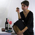
| 06/14/2006 12:32:55 AM |
Cigars and Portby _eugComment by ShutterPug: Definitely meets the challenge - cute idea and unique having a woman with a cigar. I would have liked to see your model have an expression of enjoyment though. The lighting isnt bad - but there is a bit of a shadow across the background above the table. As for the background itself - a few slight wrinkles to the left that dont bother me - but the one running vertical behind the model's head is a bit distracting. I like your choice of composition and the colors involved here. Good luck in the challenge. |
| Photographer found comment helpful. |
| 06/07/2006 02:09:10 PM |
\"Little Child\" from With the Beatlesby _eugComment by ericwoo: Hey there from the Critique Club
Camera Work/Technical: Great focus on the child's face, while using a nice depth of field to blur the distant portions of its face and hand.
Lighting: While everything is fairly evenly lit, it is also a bit flat. That probably came from using Hue/Sat to convert this one to BW. I am not very familiar with Elements, but if there is a Channel Mixer, give that a shot. While everyone has their own settings, 45%/32%/30% works pretty well for skin tones. If PSE doesn't have this, try some slight curves adjustments to bring some contrast back into the image.
Composition/Content: Great composition. This provides the eye a nice plane to flow across.
My Opinion: While not a Beatles fan (not familiar with their titles), I believe you met the challenge well. With some lighting adjustments, this one would have scored a bit better.
Eric
|
| Photographer found comment helpful. |
| 06/05/2006 07:49:43 PM |
Loungingby _eugComment by Krisby: I liked this, im one of your 8s.. One thing that came to mind when i saw this was that it is such a gental pose maybe you should have taken your glasses of, just like you where going to sleep. The not shaved part adds to this, gives it that stron manly factor. I like your work and it is allso good to know someone has a eye for my own work :) |
| Photographer found comment helpful. |
| 06/04/2006 10:50:01 PM |
|
| Photographer found comment helpful. |
| 06/01/2006 10:13:45 PM |
Loungingby _eugComment by gaurawa: **Critique Club**
My first impression is that it looks flat. The lighting is too even.. also it seems to miss the brighter zones.
I like the perspective used here. the crop though seems odd with the right top corner un-necessarily being added to the image. It may work better with a tighter crop on right making it portrait frame.
Even though flat, I like the even skin tones in the image.
I would add a bit of contrast to the image.
If you have any questions, feel free to pm me
-Gaurawa |
| Photographer found comment helpful. |
| 05/31/2006 09:01:06 PM |
|
| Photographer found comment helpful. |
| 05/31/2006 12:18:35 PM |
|
| Photographer found comment helpful. |
| 05/31/2006 05:22:45 AM |
|
| 05/31/2006 03:39:26 AM |
|
| Photographer found comment helpful. |
Home -
Challenges -
Community -
League -
Photos -
Cameras -
Lenses -
Learn -
Help -
Terms of Use -
Privacy -
Top ^
DPChallenge, and website content and design, Copyright © 2001-2026 Challenging Technologies, LLC.
All digital photo copyrights belong to the photographers and may not be used without permission.
Current Server Time: 07/17/2026 12:25:08 PM EDT.