Midas' Libraryby
smykComment by kari1: ::: Critique Club :::
Hi, my name is Kari and from the critique club.
I am unsure why you have asked for a critique when you don't like what you did .. and only entered for in your words the sake of entering something. Oh well onwards and upwards I happen to like the pic.
First Impression - the most important one:
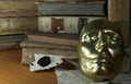
I love books and these old ones are interesting ... the mask in intriquing and adds intesting.
Composition:
this scene is a little too tightly croped for me ... I think that trying to hit the mask on the thirds vertically and horizontally would have worked better for the shot ... rather than dhaving his nose in the middle and making it a little centred.
Subject:
Meets the challenge ... I don't think you thought of the table surface .. the veneer doesn't work for this shot and covering it with fabric may have helped create an older feel which the books and mask do.
Technical (Colour and light):
The mask has a little too little light on the right side ... using something to reflect onto the side may have soften the image slightly.
To grow its vote?:
Think about all aspects .. the mask being on a piece of paper detracts a little, but having it on the table surface would have been worse ... you could have had it on one of the books and used that as the surface and also background.
Summary:
Just thoughts .. hope they help .. your portfolio is really good.
If you've got any questions about this critique, please feel free to contact me via the PM system.
Cheers
Kari