| Image |
Comment |
| 05/31/2006 08:30:38 AM |
|
 Photographer found comment helpful. Photographer found comment helpful. |
| 05/31/2006 03:53:50 AM |
|
| Photographer found comment helpful. |
| 05/30/2006 12:50:54 PM |
|
| Photographer found comment helpful. |
| 05/30/2006 12:40:37 AM |
|
| Photographer found comment helpful. |
| 05/29/2006 02:55:41 PM |
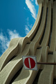
No entry- God's Playgroundby smykComment by KarenNfld: I think if the sign weren't there this photo would have much more impact. As it is now it just looks like what it is.....a photo turned on its side. It's similar to one I've seen on this site before....the Museum of Civilization, right? |
| Photographer found comment helpful. |
| 05/29/2006 10:01:52 AM |
|
| 05/29/2006 10:01:16 AM |
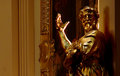
Midas.jpgby smykComment by szalona: i liek the "light" on his hand but the way the face and rest of the body is lit kind of bothers me.. gives it too much of a rough and choppy feeling whereas the statue, position wise, seems to want to depict something slightly softer and more graceful if you know what i mean. after all its in a church and i cant qutie figure out how to convey what im trying to say but hopefully oyu get my point. |
| Photographer found comment helpful. |
| 05/29/2006 09:58:41 AM |
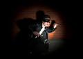
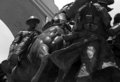
Cavalry Charge.jpgby smykComment by szalona: ohh i like this but perhaps try hightening the contrast. it feels a bit like the cavalier is loosing himself in the grainy wall whereas your title kind of gives the feeling that the point is to make them jump out of the photo so to speak. im not sur eif the contrast will fix it but try it; maybe the angle could help though i kidn of like this from the bottom becuase its as if its jumping over. |
| Photographer found comment helpful. |
| 05/29/2006 09:55:30 AM |
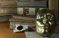
Midas' Libraryby smykComment by szalona: crap i jsut realised that most of what i said was already said. ah well it adds quantitative weight to the opinion i guess |
| 05/29/2006 09:53:33 AM |
Midas' Libraryby smykComment by szalona: i think it could have been interesting if the lighting was different. something smoother and more dramatic, you know?
the strong reflection on the mask could be used but i dont think that coming formt his angle it adds alot to the photograph. perhaps if you had a generally dark setup, and illuminated it softly from the center bottom or center top, but softly, maybe in an reddish light even but not necessarily, it could have added an element of mystery of some sort, some shady obscur feeling to the photo. perhaps as well try it with something more interesting covering the table as opposed to the plain wooden table. or just pick a different table that can compliment the ancient-ness of the subjects int eh photo because this one, perhpas color perhaps material, doesnt really match. |
| Photographer found comment helpful. |
Home -
Challenges -
Community -
League -
Photos -
Cameras -
Lenses -
Learn -
Help -
Terms of Use -
Privacy -
Top ^
DPChallenge, and website content and design, Copyright © 2001-2026 Challenging Technologies, LLC.
All digital photo copyrights belong to the photographers and may not be used without permission.
Current Server Time: 06/22/2026 07:29:21 AM EDT.