| Image |
Comment |
| 06/09/2006 10:06:30 PM |
|
 Photographer found comment helpful. Photographer found comment helpful. |
| 06/09/2006 10:04:18 PM |
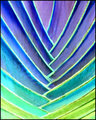
Rainbow Brightby sherpetComment by Katmystiry: I just love the colors in this!! The pattern is awesome too. Almost reminds me of a heavy stained glass. I think I want to come visit you so I can take some beautiful pictures like this :) |
| Photographer found comment helpful. |
| 06/09/2006 09:58:08 PM |
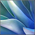
Jadeby sherpetComment by terje: Wonderful color play! I really like the colors here, it's a classic abstract and I wouldn't improve a thing! Very well done!!
Terje
|
| Photographer found comment helpful. |
| 06/09/2006 09:57:43 PM |
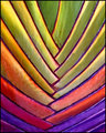
Neon Rainbowby sherpetComment by SJCarter: I don't care for this version as much as the other. I think it's because of the color tone of the "lines" (not the leaves/stripes). This doesn't seem to share the "organic" mystery that the other version has, so becomes less interesting to me personally. However, I'm sure that to someone who really likes these "cool" (and I mean that in the temperature sense) colors, it would be much more appealing. :-) Again, I think that you do terrific work and I always enjoy seeing what you have up your sleeve next! |
| Photographer found comment helpful. |
| 06/09/2006 09:57:23 PM |
|
| Photographer found comment helpful. |
| 06/09/2006 09:55:39 PM |
Rainbow Brightby sherpetComment by timfythetoo: I liek this one better than the alternate. The colors work very well. Again - like many of your shots - the processing leaves it with a very nice "painting" kind of feel that suits these odd leaves quite well. Upon staring at the pic a bit longer (which I seem to do more often than not with yours) the border lines on the right side seem to have an odd blur to them. Not sure if its from what you did with the color enhancement or what but it sets it off just a tad. Do you have a copy of the original to post to see a side by side of your processing? |
| Photographer found comment helpful. |
| 06/09/2006 09:54:21 PM |
Rainbow Brightby sherpetComment by SJCarter: At first I wasn't sure I liked this, but it's growing on me. It has nice lines and the muted colors are what make it work (I think). It has an unidentifiable quality about it - not exactly surreal because it appears to be at least partly organic, but also not exactly natural because of the unusual tones. Looking at it from a strictly abstract point of view I appreciate it more than thinking about it as a traditional "photograph" - if that makes any sense. :-) Keep up the good work and keep pushing the envelope. I think that's part of what makes you such an exciting and inspiring photographer. Message edited by author 2006-06-09 21:54:33. |
| Photographer found comment helpful. |
| 06/09/2006 08:04:43 PM |
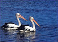
Twinsby sherpetComment by Jutilda: Oh I love this. Anytime you have two of something in a shot - it is really impactful. Good use of off centering. Nice coloration and focus too. |
| Photographer found comment helpful. |
| 06/09/2006 07:29:16 PM |
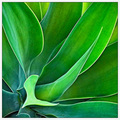
Waves of Greenby sherpetComment by PhotoArt: Beautiful photo. The light green leaf looking like the letter "L" is slightly distracting, but overall a wonderful shot. |
| Photographer found comment helpful. |
| 06/09/2006 07:27:09 PM |
Rainbow Brightby sherpetComment by Techo: I like this version a lot more than the negative (Neon Rainbow). Very nice work with the colors and the whole photo appears very painting like, which I do like here :) |
| Photographer found comment helpful. |
Home -
Challenges -
Community -
League -
Photos -
Cameras -
Lenses -
Learn -
Help -
Terms of Use -
Privacy -
Top ^
DPChallenge, and website content and design, Copyright © 2001-2026 Challenging Technologies, LLC.
All digital photo copyrights belong to the photographers and may not be used without permission.
Current Server Time: 06/20/2026 10:33:16 AM EDT.