| Image |
Comment |
| 03/15/2006 02:11:29 AM |
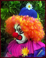
Send in the Clownsby sherpetComment by Rikki: For every few folks that do like an image, there are some that don't. Unfortunately it is something that we have to come to terms with.
With that said, I think this fits perfect for the challenge. The vibrant colors stand out and the expression on Peter's face is unmistakeable. Kinda like saying, "poor me. look at what my wife is doing". LOL!
Anyway, it seems just a tad oversharpened as seen in the flower on his chest. I like the overall feel of this image. All except for the red border. Had it been thinner, maybe 1 pixel, it would be better IMHO. FWIW, this one got an 8 from me ;) |
 Photographer found comment helpful. Photographer found comment helpful. |
| 03/15/2006 01:44:02 AM |
|
| 03/15/2006 12:22:12 AM |
|
| Photographer found comment helpful. |
| 03/14/2006 11:47:01 PM |
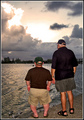
True Friendship as Size Doesn't Matterby sherpetComment by wheeledd: Sherryl,
You have an excellent eye for composition. The shapes in the clouds echo the shapes in the water and both draw the eye to the taller man, thus emphasizing the contrast between their sizes. The result is a very powerful image that I like very much.
I left a comment on your Square Crop image in which I said that the use of overly bright fill flash weakened the image. This image was also taken with strong fill flash--and I also think that it would be better without it. The natural light in the scene is shining towards the front of the two men so their backs should be in shadow. But their backs are brightly lit and there are even shadows going towards the apparent light source. To me, this gives the image an unnatural quality. If you had turned off the flash, maybe it would even have gotten a ribbon.
--Dan |
| Photographer found comment helpful. |
| 03/14/2006 11:21:51 PM |
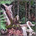
Ancient Forrestby sherpetComment by wheeledd: Sherryl,
I thought this photo was pretty good for the square crop challenge. (I gave it a 5.) The powerful wooden forms on the left interact with the jumble of smaller wooden shapes on the lower right. There is another dynamic relationship between the green leaves in the left foreground and those at a distance in the upper right. The square shape reinforces these relationships--and thus makes this a good entry for the challenge.
So why didn't it do better in the challenge? I've looked at the original that you posted and I think that the basic problem is the lighting rather than over processing. You shot with fill flash but it was too strong to just be a fill for the other light. The wooden shapes on the lower right are very harshly lit with highlights that are almost burned out and rims of dark shadows behind them. You have lost the nice texture that is apparent in the trunks on the left.
This is supposed to be an ancient forest. The natural light in a forest is filtered through the trees and is usually very soft. The light from the flash destroys the forest mood and makes the image look very unnatural.
You also used fill flash on your Odd Couple image. Please also read my comment on it.
--Dan |
| Photographer found comment helpful. |
| 03/14/2006 10:24:20 PM |
|
| Photographer found comment helpful. |
| 03/14/2006 08:14:40 PM |
Ancient Forrestby sherpetComment by sherpet: I have learned a valuable lesson here, re this image, as I realized that I "over processed" it so as to get it into the challenge on time.
I took it on the day of roll-over, so maybe rushed it.....
I entered it with about 2 minutes to spare, and this is something I will NEVER do again.....
PLEASE don't judge me on this image alone but visit my portfolio to see what I have learned and hopefully you will see other that are much better.
I feel quite ashamed, and I would like to put my head in a brown bag, along with this photo. Message edited by author 2006-03-14 20:17:54. |
| 03/14/2006 06:15:09 PM |
Ancient Forrestby sherpetComment by klstover: As mentioned before, it looks oversharpened - makes it seem like a cardboard cutout to me. But I really like the earthy colors, and composition, except for the tree in the middle of the background "growing" from the stump in the middle. I think that takes away some of the depth, adding to the cardboard cutout look.
Edit:
Forgot to say that if you adjusted the angle so the tree doesn't seem attached to the stump, the stump would probably be at a less flattering angle. If that'd be the case, I think what you have done would be the better choice. Message edited by author 2006-03-14 22:27:46. |
| Photographer found comment helpful. |
| 03/14/2006 06:02:34 PM |
|
| Photographer found comment helpful. |
| 03/14/2006 02:57:27 PM |
|
| Photographer found comment helpful. |
Home -
Challenges -
Community -
League -
Photos -
Cameras -
Lenses -
Learn -
Help -
Terms of Use -
Privacy -
Top ^
DPChallenge, and website content and design, Copyright © 2001-2026 Challenging Technologies, LLC.
All digital photo copyrights belong to the photographers and may not be used without permission.
Current Server Time: 06/12/2026 12:33:43 AM EDT.