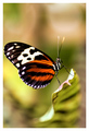
DPChallenge: A Digital Photography Contest You are not logged in. (log in or register
 
Browse Settings
Currently viewing:
Registered Usermia67

Show comments:

Per page:

Order:

Comments:


Comments Received by mia67
Pages:   ... [177] [178] [179] [180] [181] [182] [183] ... [215]
Showing 1791 - 1800 of ~2142
Image Comment
Elegance
03/20/2007 03:40:51 PM
Elegance
by mia67

Comment by Jedusi:
nice picture.
Photographer found comment helpful.
Elegance
03/20/2007 12:33:31 PM
Elegance
by mia67

Comment by sacredspirit:
Beautiful portrait, beautiful model. The only problem I can reckognize here, is the amazing competition at hand. You have to get more pizazz out of your photo to place high. IMO, the white background could be better, it takes away from her beautiful brown skin. Also, a brown skin person has an amazing advantage with jewelry. IMO, gold, diomands, and maybe even pearls never look better than on brown skin, perhaps something like that could of been incorporated for more pop.

A big gold looped earring, a nice bright choker, but not white. And a changing of the background to a more settle solid color, and dim the lights. I dont know if it'd work, but I'd certainly love the challenge. All this, and I'm still giving the photo at hand a 7.
Photographer found comment helpful.
Tulip
03/20/2007 02:06:08 AM
Tulip
by mia67

Comment by MelonMusketeer:
The backlight, the shadow and the subject combine to make this a very pretty image. Simplicity is powerful. The desat is nice too.
Photographer found comment helpful.
My Kingdom
03/19/2007 01:50:48 PM
My Kingdom
by mia67

Comment by Artifacts:
Positives:
Beautiful macro with good color and softness that highlights the butterfly well. Nicely captured profile view. Good attempt at DOF such that the butterfly is sharply focused and everything else is not.

Technicals:
You chose to make the head and thorax sharpest and that is the correct decision. The impact of this image is absolutely dependent on perfect technicals. Though good, there are some things that are slightly off. The wing is little soft. In this particular instance the viewer will subconciously want the wing as sharp as the rest of the image and it is not.

There is a lot of extra space both above and below the butterfly that add very little to the composition. The space above the butterfly particularly has some sharpness aspects that actually act as a viewer distraction.

The challenge:
In a free study the technicals of a photograph affect it more than anything else since there is not such thing as DNMC. Technicals held this back more than anything else.

Suggestions:
You might consider cropping out some of the the top and bottom parts of the image to reduce \'wasted\' space. If you want to include the top part then you might want to use the blur tool to reduce it\'s distracting aspects. The wing is very close to the border and that is a slight distraction so moving it to the right would help.

You might consider bagging the white border all together. I\'m biased about that, though. I think borders are a waste of space, especially when limited to 640 pixels and would likely be removed for prints anyway. I don\'t vote down for them, but others could.

It would be nice to have the antennae in focus but that is tough.

The original was taken at f/2.8 and 1/125th second. Butterfly\'s generally have to be taken hand held and that affects what you can do. When the subject is still like this one is taking at a slower shutter speed for a slightly larger f/stop and therefore a little greater depth of field would be recommended.

Btw... I like butterfly imagery and taken a few myself:
//www.pbase.com/azleader/butterfly
Photographer found comment helpful.
Elegance
03/19/2007 12:27:07 AM
Elegance
by mia67

Comment by DrAchoo:
focus looks to be at the nose and not the eyes. 5
Photographer found comment helpful.
Elegance
03/19/2007 12:17:16 AM
Elegance
by mia67

Comment by Ivory:
Great pose, love the way she is looking out the side of her eyes, 9 from me.
Photographer found comment helpful.
LIGHT 2.jpg
03/16/2007 03:19:03 AM
LIGHT 2.jpg
by mia67

Comment by mia67:
Thanks everybody for a wonderful comments!
LIGHT 2.jpg
03/15/2007 11:00:16 PM
LIGHT 2.jpg
by mia67

Comment by MelonMusketeer:
This is a soul soothing image. Thank you for posting it.
Photographer found comment helpful.
B & W Collection
03/14/2007 10:22:12 AM
B & W Collection
by mia67

Comment by mia67:
Thanks for the comments.
Going Home
03/13/2007 07:02:32 AM
Going Home
by mia67

Comment by PHOTOKID:
Nice job with the white balance in the snow, its hard to properly expose in snow when trying to get a candid shot like this one. Good use of the cleared pavement in front of them to create a diagonal to add depth to the photo. I think the composition is good as neither of them are centered and the boy is on the lower 3rd horizontal.DOF maybe could have been a bit deeper to keep the mothers hat in focus, but it really doesnt make a difference.

I like the colorations and tonalities of this photo, it has an overall feel of B&W throughout the contrasts of the photo but has the boy in red as if a selective desaturation was done. This photo shows you have a very good eye for composition, know your camera and that you look for things that stand out or are different in your world.

Nice Job.
Rich
Photographer found comment helpful.
Pages:   ... [177] [178] [179] [180] [181] [182] [183] ... [215]
Showing 1791 - 1800 of ~2142


Home - Challenges - Community - League - Photos - Cameras - Lenses - Learn - Help - Terms of Use - Privacy - Top ^
DPChallenge, and website content and design, Copyright © 2001-2025 Challenging Technologies, LLC.
All digital photo copyrights belong to the photographers and may not be used without permission.
Current Server Time: 06/19/2025 01:37:32 AM EDT.