| Image |
Comment |
| 01/11/2007 11:17:22 AM |
|
 Photographer found comment helpful. Photographer found comment helpful. |
| 01/11/2007 01:28:46 AM |
|
| Photographer found comment helpful. |
| 01/11/2007 12:16:23 AM |
|
| Photographer found comment helpful. |
| 01/10/2007 10:24:45 AM |
|
| Photographer found comment helpful. |
| 01/10/2007 02:54:12 AM |
|
| Photographer found comment helpful. |
| 08/23/2006 05:17:37 PM |
water water...Am I the cutest camera?by honikumComment by atupdate: Anil,
Per your PM, I’ve taken a stab at your Camera Self Portrait entry (Click on the thumbnail below). Just so you know, the file size was kind of small (99kb), so the results are not a good as if I had the original to work with. First thing I did was to crop the photo so the framing from by the pot was uniform on the left and right side of the image. Second, I adjusted the contrast using Levels. My levels settings for the input were Black 21, Gamma (Middle) 1.6, and White 221. I use Paint Shop Pro X but I think the Photoshop uses the format for levels. I also used USM (Radius 1, Strength 60, Clipping 5) before saving the image. As you can see there is a lot more detail in your face and the camera with this simple adjustment.
As I stated in my PM, I highly suggest you play with the fotomann tutorial for B&W conversion on this image. It works a lot better than desaturation.
Tim
 |
| Photographer found comment helpful. |
| 08/21/2006 12:16:12 PM |
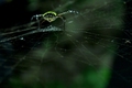
Web of Lifeby honikumComment by BMacD: Hi! Here’s a comment from the Critique Club.
First Impression:
Nice shot! My eyes went to the spider, the bottom right corner along the bottom and then back to the spider body
Composition:
I like the balance of dark and green. Top left dark balances with the bottom right dark area. The spider balanced by the green area in the bottom right. I think I may have changed the angle slightly to see more of the spider body.
Subject:
Meets challenge, but does not come across as an obvious “looking up” shot.
Technical:
I like the lighting and colours. DOF is really shallow. Would have been nice to have more of the spider and web in focus. You didn’t mention cropping. If this was out of camera placement, well done.
Summary:
Nice capture and colours. The lack of obvious “looking up” and the shallow perspective on the spider may have hurt your score. Voters usually don’t spend a lot of time figuring out what they are looking at. Good luck in future entries!
|
| Photographer found comment helpful. |
| 08/17/2006 04:55:50 PM |
water water...Am I the cutest camera?by honikumComment by atupdate: Back to comment: This image has very little detail of the camera visible and it could use more contrast. You could have used a couple of reflectors (white poster board or crumpled aluminum foil) to help direct some light between you and the water to improve the detail issue. The contrast issue is fixable using a number of post processing tools, like brightness/contrast, levels, or curves. I'm not that experienced with curves but I would be willing to play around with your image with levels if you would like to see how it might look. Feel free to PM me. |
| Photographer found comment helpful. |
| 08/16/2006 02:41:39 PM |
|
| Photographer found comment helpful. |
| 08/16/2006 09:55:25 AM |
|
| Photographer found comment helpful. |
Home -
Challenges -
Community -
League -
Photos -
Cameras -
Lenses -
Learn -
Help -
Terms of Use -
Privacy -
Top ^
DPChallenge, and website content and design, Copyright © 2001-2026 Challenging Technologies, LLC.
All digital photo copyrights belong to the photographers and may not be used without permission.
Current Server Time: 07/16/2026 08:31:55 PM EDT.