| Image |
Comment |
| 05/23/2007 01:42:51 PM |
|
 Photographer found comment helpful. Photographer found comment helpful. |
| 05/22/2007 03:54:27 PM |
|
| Photographer found comment helpful. |
| 05/21/2007 08:54:55 AM |
|
| Photographer found comment helpful. |
| 05/21/2007 05:33:15 AM |
|
| Photographer found comment helpful. |
| 05/08/2007 01:42:55 PM |
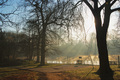
sunrise at the lakeby alpharichComment by ursula: Greetings from the Critique Club
Strong points: The light. The light is very beautiful in this image, it's what makes the image.
Possible weaknesses: It's not all that interesting of a place (for a picture in a challenge I mean).
Overall, I think this is a beautiful image, because of the light, but outside of that there isn't much to hold anyone (except if you know the place and want to remember the good times you had there). It's a real pity you didn't get more comments. I don't think the "distractions" are an issue here, but it is possible that a slightly different crop (or different position to make the image) would help.
As for the post-processing, I think it is really quite adequate for the picture. One possibility would be to intensify the red tones a bit, I don't know for sure. To me the colours look right.
I'm really not sure what to tell you. I think it is a beautiful shot as it is, but it is not one that will stand out amongst 500 other shots. I hope this helps.
~Ursula |
| Photographer found comment helpful. |
| 05/07/2007 08:51:19 AM |
Lord & Lady of Bluebell Woodsby alpharichComment by timfythetoo: Greetings from the Critique Club -
Looks like you had a pleasant walk through the woods. Very cool to have statues like this standing along the paths.
Well - you obviously met the challenge and your layout is good. Nice choice to have the statues on either side kind of like guardians.
The colors on the statue images seem a bit oversaturated and a little too fourescent. Toned down a bit to give more of a natural color I think would have been nicer. I havent really done any HDR work but maybe this is a result from that. The colors on the flower and its background bokeh seem more natural, even though the greens are probably the same as the other images.
I think my biggest issue is with the statues not being symmetrical in the frames. It leaves the overall image feeling a bit unbalanced. The strongest image is the center one. Having the other two be more similar woudl have been better bookends for the flower.
That said - your vote spread is pretty tight. Not a stinker of an image for sure but also not a stunner that would have brought you the higher votes. You have an in general pleasing image here and nothing to be ashamed of. Keep on working at it and the higher scores will come.
Tim
|
| 05/06/2007 02:42:37 PM |
sunrise at the lakeby alpharichComment by Tez: Lovely lighting through the trees, but i feel it deserves more space on the picture instead of the paths to the left. A very nice picture. |
| 05/06/2007 01:25:27 PM |
Lord & Lady of Bluebell Woodsby alpharichComment by LuDeLush: tells an interesting story, Kinda wish the composition of the two statues were more dynamic, or had the same depth of field the blue bells have. They seem out of place with the flowers. Just a thought. |
| Photographer found comment helpful. |
| 05/04/2007 12:12:49 AM |
whisk - close-upby alpharichComment by karmat: CRITIQUE CLUB CRITIQUE
by karmat
There is a small amount of irony that I've drawn your image to critique. I thought about this exact same shot with a miniature wire whisk that I have. :)
Compositionally, I think this is one of the few shots that works with basically a centered composition. Perhaps it is because the whisk is dominantly circular shaped. It doesn't have the static feeling that many centered shots have. It is also helped by the fact that it sits low in the frame, and that gives it a balanced, stable feeling. Also, the coiling of the whisk gives the eyes a path to follow through the frame.
Technically, it is also well done. The focus is right on, and the shallow dof helps the handle to "disappear"and not be a distraction. Exposure is good and you have controlled the reflections well enough that they are not blaringly distracting.
overall, it is a technically well-done shot, but it lacks some appeal to really make the viewer stop and go "WOW." (Well, I did, but that was for the reason mentioned above). There is little to grab the eye past the initial viewing of a well shot whisk. A different angle may have helped (at the risk of losing the nice shape you have) or a different background. Putting the whisk in front of something related may have helped give it more context and interest, or even just a brightly colored background. DPC seems to like bright blue. :)
Nicely done. If I need to clarify or further explain myself, please feel free to contact me.
Karma |
| Photographer found comment helpful. |
| 05/03/2007 11:07:04 PM |
|
| Photographer found comment helpful. |
Home -
Challenges -
Community -
League -
Photos -
Cameras -
Lenses -
Learn -
Help -
Terms of Use -
Privacy -
Top ^
DPChallenge, and website content and design, Copyright © 2001-2026 Challenging Technologies, LLC.
All digital photo copyrights belong to the photographers and may not be used without permission.
Current Server Time: 06/13/2026 09:33:27 PM EDT.