| Image |
Comment |
| 11/01/2006 07:14:11 AM |
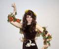
Mother Natureby PixlmakerComment by kat75: This is really cool but would have been better with a bounced flash or a Lightsphere (she's kind of close to the wall). I love it though! :) She makes a great model for this shot. Message edited by author 2006-11-01 07:14:47. |
 Photographer found comment helpful. Photographer found comment helpful. |
| 10/31/2006 07:37:55 PM |
|
| Photographer found comment helpful. |
| 10/31/2006 07:26:00 PM |
Mother Natureby PixlmakerComment by -Bec-: I know this was just a quick shot but her pose makes it more than that, very mannequin like.. |
| Photographer found comment helpful. |
| 10/31/2006 07:15:01 PM |
|
| 10/30/2006 09:19:18 AM |
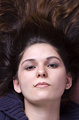
Jennifer Faceby PixlmakerComment by Louis: In response for your request for comments on this image: In my opinion, the extreme closeup is not flattering to her. She's beautiful, and the other pictures in the series are great, but here you can't see that. I'm sure she's fully expecting flattering studio shots. Having sent her this may have surprised her. You can see every detail in her face, every hair, and every imperfection, and I'm almost certain she's looking at those details, rather than the artistic merits of the processing job.
As for the particular job done here, in my opinion selective desat is overdone, and must be done really well, or uniquely, to work. Here she just looks sallow to me, and her eyes look bloodshot. Again, it's not flattering, which is fine if you're going for a particular emotive feel, but I don't think you are. It's my opinion that the processing should support both the photograph and the subject matter, and there are hundreds of examples at this site where that's done to great effect. In my personal opinion only, I just don't think this works well here. If I were to continue with this shot, I would probably work the hell out of it, and find a reason to highly edit such a tight shot to get a definite mood out of it (and I'd probably overdo things in the process).
Having said that, the other pictures in the series are really excellent, the lighting is spot on, and it's clear from those pictures how beautiful she is. She should be very pleased with those. |
| Photographer found comment helpful. |
| 10/29/2006 07:03:14 PM |
Jennifer Faceby PixlmakerComment by Prism: Unless you really like the grey skin, my suggestion to get "artsy" with this shot would be to make it more high key by increasing the brightness to the point where you lose the skin texture but keep some of the shadows around her eyes and nose. Just paly around with an adjustment layer and see what it does for it. You should also try and take out the redness in the whites of her eyes. With the grey skin tones, the red in the eyes becomes very prominent. I like the crop and think this has potential. Keep playing, you never know where it will take you! |
| Photographer found comment helpful. |
| 10/29/2006 06:56:41 PM |
|
| Photographer found comment helpful. |
| 10/29/2006 06:50:51 PM |
Jennifer Faceby PixlmakerComment by alfresco: It looks like the cover to Six Feet Under - the selective desat kinda spooks me out!
The one thing I find off are the eyes, they aren't level - it makes me think her head is out of whack.
Excellent focus and dof - very nicely photographed. |
| Photographer found comment helpful. |
| 10/26/2006 01:54:25 PM |
Jennifer Portraitby PixlmakerComment by nova: She's lovely indeed. The shot seems a bit bright to me, both the subject lighting and backdrop lighting. I guess that's a seam in the backdrop at the top? I think you can crop that out and still maintain 2000x3000 pixels needed for a LARGE file at istock. Man her skin is flawless, she'll be a wonderful model for future shoots. Keep her happy! |
| Photographer found comment helpful. |
| 10/24/2006 03:13:30 PM |
Kelly Photoshoppedby PixlmakerComment by jenesis: It could just be my monitor but the whites of her eyes look a touch pink. Maybe taking the sponge tool set to desaturate might help a little or selecting just her eyes and dropping the red/magenta?? Otherwise, it's quite pretty. I love the raised eyebrow and the little shine on her lips. The way it's cropped makes her hand look a little weird though. Perhaps leaving in more of the hand since it doesn't look like it can be cropped out, maybe?? Sorry, if I'm being too nitpicky, just some observations I made.
Overall, I think you did a great job with the editing no matter how much or little it was. :) |
| Photographer found comment helpful. |
Home -
Challenges -
Community -
League -
Photos -
Cameras -
Lenses -
Learn -
Help -
Terms of Use -
Privacy -
Top ^
DPChallenge, and website content and design, Copyright © 2001-2026 Challenging Technologies, LLC.
All digital photo copyrights belong to the photographers and may not be used without permission.
Current Server Time: 07/15/2026 09:17:38 PM EDT.