DPChallenge: A Digital Photography Contest You are not logged in. (log in or register
 
Challenge Entries
This image is not a part of any challenge.
Portfolio Images
This image is not part of a public portfolio.
Jennifer Face
Jennifer Face
Pixlmaker


Photograph Information Photographer's Comments
Camera: Canon EOS-350D Rebel XT
Lens: Canon EF 24-105mm f/4.0L IS
Location: Home Studio
Date: Oct 25, 2006
Galleries: Portraiture, Studio
Date Uploaded: Oct 29, 2006

Viewed: 555
Comments: 3
Favorites: 0

Messing around in Photoshop. What can I say, I was bored... :o)

Please log in or register to add your comments!

AuthorThread
10/30/2006 09:19:18 AM
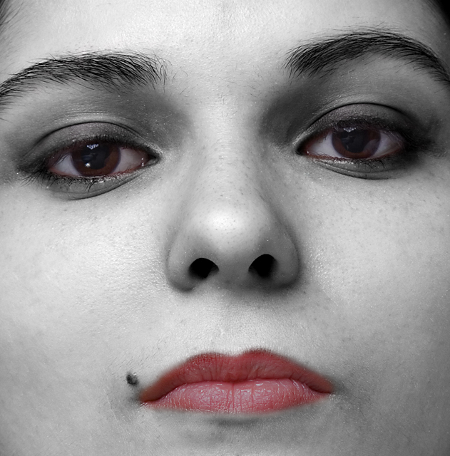
In response for your request for comments on this image: In my opinion, the extreme closeup is not flattering to her. She's beautiful, and the other pictures in the series are great, but here you can't see that. I'm sure she's fully expecting flattering studio shots. Having sent her this may have surprised her. You can see every detail in her face, every hair, and every imperfection, and I'm almost certain she's looking at those details, rather than the artistic merits of the processing job.

As for the particular job done here, in my opinion selective desat is overdone, and must be done really well, or uniquely, to work. Here she just looks sallow to me, and her eyes look bloodshot. Again, it's not flattering, which is fine if you're going for a particular emotive feel, but I don't think you are. It's my opinion that the processing should support both the photograph and the subject matter, and there are hundreds of examples at this site where that's done to great effect. In my personal opinion only, I just don't think this works well here. If I were to continue with this shot, I would probably work the hell out of it, and find a reason to highly edit such a tight shot to get a definite mood out of it (and I'd probably overdo things in the process).

Having said that, the other pictures in the series are really excellent, the lighting is spot on, and it's clear from those pictures how beautiful she is. She should be very pleased with those.
  Photographer found comment helpful.
10/29/2006 07:03:14 PM
Unless you really like the grey skin, my suggestion to get "artsy" with this shot would be to make it more high key by increasing the brightness to the point where you lose the skin texture but keep some of the shadows around her eyes and nose. Just paly around with an adjustment layer and see what it does for it. You should also try and take out the redness in the whites of her eyes. With the grey skin tones, the red in the eyes becomes very prominent. I like the crop and think this has potential. Keep playing, you never know where it will take you!
  Photographer found comment helpful.
10/29/2006 06:50:51 PM
It looks like the cover to Six Feet Under - the selective desat kinda spooks me out!

The one thing I find off are the eyes, they aren't level - it makes me think her head is out of whack.

Excellent focus and dof - very nicely photographed.
  Photographer found comment helpful.


Home - Challenges - Community - League - Photos - Cameras - Lenses - Learn - Help - Terms of Use - Privacy - Top ^
DPChallenge, and website content and design, Copyright © 2001-2025 Challenging Technologies, LLC.
All digital photo copyrights belong to the photographers and may not be used without permission.
Current Server Time: 06/18/2025 01:52:30 AM EDT.