| Image |
Comment |
| 01/12/2006 12:53:16 AM |
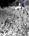
butterflyby ZenjohnComment by sherpet: I like the idea of the B/W image with a burst of color in the butterfly. maybe zoomed in a little closer... |
 Photographer found comment helpful. Photographer found comment helpful. |
| 01/11/2006 10:53:17 PM |
butterflyby ZenjohnComment by gsquiggle: Hmm.. a lot of negative space here, maybe a crop would do it justice, but my eyes are distracted from the butterfly and looking down at the other plants. |
| Photographer found comment helpful. |
| 01/10/2006 12:51:46 PM |
butterflyby ZenjohnComment by Pooba: I think this would have worked better with a much tighter crop.Maybe keeping only the top right quadrant of the shot. |
| Photographer found comment helpful. |
| 01/09/2006 11:16:32 PM |
butterflyby ZenjohnComment by digitalknight: this is a great idea, I would love this cropped closer, more butterfly in the frame and less "stuff" - great work |
| Photographer found comment helpful. |
| 01/09/2006 05:43:34 PM |
butterflyby ZenjohnComment by kteach: I can tell that you were using a shallow dof here, but the removal of the color makes it all sort of fuzzy and hard to figure out. The butterfly too seems overprocessed and unnaturally colored. |
| Photographer found comment helpful. |
| 01/09/2006 04:31:13 PM |
butterflyby ZenjohnComment by Crisik: seems to be too busy for me (even in bw), tighter crop of the butterfly - if possible - would probably help to boost contrast as well as catch more attention |
| Photographer found comment helpful. |
| 01/09/2006 09:07:07 AM |
butterflyby ZenjohnComment by shudderbug: I like the idea and the minimalism plus it's a beautiful butterfly, but to me the subject should be a bit larger and the whites are very blown:-( |
| Photographer found comment helpful. |
| 01/08/2006 06:13:54 PM |
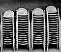
chairsby ZenjohnComment by HCvE: It will not get boring because of the 'movement' it has. The pattern and lines create the idea of movement when you let your eyes go over the picture. I see I gave it a 7 but now think it should have been more, sorry. |
| Photographer found comment helpful. |
| 01/08/2006 05:41:15 PM |
chairsby ZenjohnComment by fotomann_forever: ***Greetings from Critique Club***
Wow, I get to critique one of my favorite images in the challenge. You've taken something that is rather boring and made it interesting. Good Job! This is what photography as art is about.
Technically, you've created a good image here. Focus is sharp. Exposure is good and lighting is interesting. Compositionally, I doubt I'd change anything about your image.
I admire your use of high contrast black and white. I believe it makes this photo.
I really am unable to tell you much about how to improve it. Perhaps the crop is a little tight, but not so tight that it harms the image much. Perhaps you could have given it a little more pop with a low angle or high angle of view ... give the voters a little WOW to get them going.
Overall, you've created a good piece of art here and crossed 5.9 in only your second challenge. Good work! You're gonna do well here. I can't wait to see more from you.
Take care,
Leroy |
| Photographer found comment helpful. |
| 01/03/2006 10:45:51 PM |
chairsby ZenjohnComment by banmorn: This reminds me of the Marathon Grill at 19th and Market in Philly. The have the chairs set up on the wall there when not in use. The wall looks different here. Like the pattern...could have made a fine abstract by closing in on the stacks and shooting at an angle...but that's probably just me. Nice find. |
Home -
Challenges -
Community -
League -
Photos -
Cameras -
Lenses -
Learn -
Help -
Terms of Use -
Privacy -
Top ^
DPChallenge, and website content and design, Copyright © 2001-2026 Challenging Technologies, LLC.
All digital photo copyrights belong to the photographers and may not be used without permission.
Current Server Time: 07/15/2026 02:24:22 PM EDT.