Distintoby
DirtypainterComment by HBunch: *Critique Club*
I simply LOVE the comments you got on this shot.
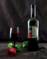
Nice job on the lighting with this one. -- the reflection on the glass is a bit distracting.
Too bad your back drop is wrinkly. -- great background
needs better lighting -- you really did do a great job using the lighting
So, what have we learned? Not a darned thing. lol Beauty is subjective, and that is screamed in the comments you received. I'll throw in my subjective advice too.
My very first impression of the photo was that the background had creases, and I wished that I could see the label a bit better.
The focus on the photo is very nice, but off just enough to make the small lettering look a little fuzzy and hard to get much detail out of. Even if I couldn't read it, I would like to see it crisp.
Now, lets talk about the background for a sec. I personally like the color. the darkness is good and goes well with the ground cloth and helps show the color of the subjects well in my opinion. The creases bug me to death. There is a crease horizontally through the photo and also one coming straight out the top of the bottle. Very distracting. I do not so much mind the wrinkles, I think actually, I would prefer a wrinkled/textured background to a solid dark one, so that doesn't bug me, but the creases are too much.
I like the set up. One thing that the commenters who mentioned it all agree on is that they wish the rose were real. To me, it's not a huge deal, but fake flowers remind me of funerals, real flowers remind me of love/romance/elegance. This, would in the end, be more effective with a real flower, but probably only matters to people who sit here analyzing these things.
Overall, great shot for the challenge, nicely set up, but needs a cleaner background. (but not too clean)
~Heather~