Restby
tjmuellerComment by CEJ: Hello from the Critique Club!
I have studied your image and have the following to offer:
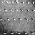
Composition/perspective - a very unique perspective demonstrating a very creative thought process and the ability to translate that to an image. I like the shadows but feel a little later on in the day they would have been longer which would have made this a much more dramatic shot. Although an interesting scene, there really is not much to capture your attention after the first look. Hence, longer shadows would have added much more mood to the shot. The focus seems slightly off or perhaps sharpening a bit. But no place really looks clear and I find myself wandering around the image looking for something or a sharp area that may be the center of attention although not the scene. The larger stone in the top row is too close to the edge to be significant.
Color - b/w, but seems flat. Perhaps a boost in the contrast and levels adjustment would help this. Being so far away from the grass you lose that texture, but it would help to distinguish the shadows from the surroundings. In some areas they start to get lost.
Lighting - good use of natural light in concept, but more advantage could have been taken. Again, the shadows (see above). The control here is good though. There are no real blown out areas although some of the stones are a little bright.
Challenge requirements - this certainly is a representation of a 'Dead End' as the requirements defined it.
Overall/my opinion - in concept this is a good idea and you executed it well for what you captured. I think this shows a creative idea that fell short for many reasons. Visually, there is not much here. As stated above longer shadows would have really helped. Perhaps not so high above or zoomed in to emphasize fewer stones, longer shadows, and let the geometry and light work for you.