| Image |
Comment |
| 10/26/2005 06:00:56 PM |
|
| 10/26/2005 03:46:51 PM |
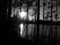
Sceneby Phoenix9244Comment by Ennil: Weird how this is the exact opposite of the challenge. I'm sorry but it's not even that great a picture. The sun is overexposed, the trees are underexposed and though you have tryed to create an effect of silhouettes here it was useless. I do like your choice of B&W for a landscape but here everything was executed wrong. There's a lack of composition, a lack for a good concrete idea... Needs a little work. |
| 10/26/2005 03:05:37 PM |
|
| 10/26/2005 02:14:37 PM |
Sceneby Phoenix9244Comment by Elaine: I don't think this fits the challenge. Otherwise, I find the sun's brightness and the shadows in the left corner distracting. |
| 10/26/2005 03:35:25 AM |
Sceneby Phoenix9244Comment by Rasmus: Pro: Nice use of light and shadows, and good vertical lines
Con: Does not fit well into the challenge theme, and the horisontal line could be more straight. |
| 10/26/2005 01:40:01 AM |
|
Home -
Challenges -
Community -
League -
Photos -
Cameras -
Lenses -
Learn -
Help -
Terms of Use -
Privacy -
Top ^
DPChallenge, and website content and design, Copyright © 2001-2026 Challenging Technologies, LLC.
All digital photo copyrights belong to the photographers and may not be used without permission.
Current Server Time: 07/15/2026 05:29:27 PM EDT.