| Author | Thread |
Comments Made During the Challenge  |
|
|
11/01/2005 08:34:55 PM |
|
|
|
11/01/2005 05:14:53 PM |
|
I like the idea on this one, but somehow the composition just seems a little too busy. Also seems tilted. |
|
|
|
10/29/2005 01:01:51 PM |
|
|
|
10/28/2005 03:58:12 PM |
|
That's more light on dark; doesn't fit the challenge IMO. |
|
|
|
10/28/2005 03:55:38 PM |
|
I like the shot! I'm not sure how it is light on white, but good shot nonetheless. |
|
|
|
10/28/2005 07:38:33 AM |
|
I think that your photo doesn't meet the challenge of 'light colour' against a white background. |
|
|
|
10/27/2005 05:58:30 PM |
|
|
|
10/27/2005 01:52:07 PM |
|
In my opinion I think it is to dark to be a light on white photo |
|
|
|
10/26/2005 08:43:24 PM |
A very beautiful picture – but it doesn’t fit the light on white challenge.
Good luck with the entry. :o\
|
|
|
|
10/26/2005 07:50:08 PM |
|
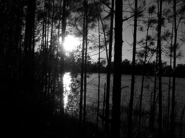
A very nice silhouette but it doesn't quite meet the challenge to me. The lighting is nice and the composition is decent though the horizon seems a bit off-kilter. Focus looks okay. I gave a 3, had it been in another challenge I would have scored it higher. |
|
|
|
10/26/2005 06:00:56 PM |
|
remember the category to dark |
|
|
|
10/26/2005 03:46:51 PM |
|
Weird how this is the exact opposite of the challenge. I'm sorry but it's not even that great a picture. The sun is overexposed, the trees are underexposed and though you have tryed to create an effect of silhouettes here it was useless. I do like your choice of B&W for a landscape but here everything was executed wrong. There's a lack of composition, a lack for a good concrete idea... Needs a little work. |
|
|
|
10/26/2005 03:05:37 PM |
|
sorry, see no light color on white background |
|
|
|
10/26/2005 02:14:37 PM |
|
I don't think this fits the challenge. Otherwise, I find the sun's brightness and the shadows in the left corner distracting. |
|
|
|
10/26/2005 03:35:25 AM |
Pro: Nice use of light and shadows, and good vertical lines
Con: Does not fit well into the challenge theme, and the horisontal line could be more straight. |
|
|
|
10/26/2005 01:40:01 AM |
|
Home -
Challenges -
Community -
League -
Photos -
Cameras -
Lenses -
Learn -
Help -
Terms of Use -
Privacy -
Top ^
DPChallenge, and website content and design, Copyright © 2001-2026 Challenging Technologies, LLC.
All digital photo copyrights belong to the photographers and may not be used without permission.
Current Server Time: 06/28/2026 11:01:47 AM EDT.