| Image |
Comment |
| 09/04/2006 04:53:41 PM |
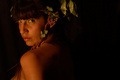
Nymphby BrielleComment by photom1946: A little too much of the photo dark on the right side. I looked at it with that area covered and it looks so much better. |
 Photographer found comment helpful. Photographer found comment helpful. |
| 09/03/2006 07:33:30 PM |
|
| Photographer found comment helpful. |
| 09/03/2006 06:34:49 PM |
Nymphby BrielleComment by jeannybeany: Nice portrait... the composition works well with the idea... lighting is excellent on her face... very nice |
| Photographer found comment helpful. |
| 09/02/2006 03:32:27 PM |
|
| Photographer found comment helpful. |
| 09/01/2006 01:37:42 PM |
Nymphby BrielleComment by hanneke: I love your idea here, but your entry could use some sharpness & I think your whitebalance was off. |
| Photographer found comment helpful. |
| 09/01/2006 11:24:01 AM |
Nymphby BrielleComment by Konador: Composition: 6 - The negative space to the right works well but I don't like the crop at the top
Technical: 3 - It seems way too dark. There is almost no detail in the hair and the eyes especially need to be a lot brighter.
Creativity: 5 - The leaves in the hair etc are a good attempt to make it a unique portrait, but a more interesting angle and pose etc would add interest.
Appeal: 4
Overall Calculated Average Score: 4 |
| Photographer found comment helpful. |
| 07/30/2006 10:56:44 PM |
|
| Photographer found comment helpful. |
| 07/30/2006 02:30:10 PM |
|
| Photographer found comment helpful. |
| 07/29/2006 05:22:05 PM |
|
| Photographer found comment helpful. |
| 07/28/2006 02:19:44 AM |
|
| Photographer found comment helpful. |
Home -
Challenges -
Community -
League -
Photos -
Cameras -
Lenses -
Learn -
Help -
Terms of Use -
Privacy -
Top ^
DPChallenge, and website content and design, Copyright © 2001-2026 Challenging Technologies, LLC.
All digital photo copyrights belong to the photographers and may not be used without permission.
Current Server Time: 07/16/2026 03:44:46 PM EDT.