DPChallenge: A Digital Photography Contest You are not logged in. (log in or register
 
Browse Settings
Currently viewing:
Registered Usercatpixel

Show comments:

Per page:

Order:

Comments:


Comments Received by catpixel
Pages:   ... ...
Showing 91 - 100 of ~320
Image Comment
The Empire State Building, (shrunken)
02/04/2003 02:11:25 PM
The Empire State Building, (shrunken)
by catpixel

Comment by Dustin:
this is a very good picture. i like the psosition of the subject.
Photographer found comment helpful.
Sky-scraper topping out--before and after.
02/04/2003 01:20:49 PM
Sky-scraper topping out--before and after.
by catpixel

Comment by MajorChaos:
I like the concept, the photo is a little out of focus, I would have liked to see more of the building under construction. (8)
Photographer found comment helpful.
The Empire State Building, (shrunken)
02/04/2003 01:51:17 AM
Sky-scraper topping out--before and after.
02/03/2003 05:10:22 PM
Sky-scraper topping out--before and after.
by catpixel

Comment by justine:
What a clever find.....wow. Good for the challenge. The shot is a bit dark here, but the idea is A+.
Photographer found comment helpful.
The Empire State Building, (shrunken)
02/03/2003 04:43:16 PM
The Empire State Building, (shrunken)
by catpixel

Comment by sher:
cool shot...fun perspective!
Photographer found comment helpful.
Sky-scraper topping out--before and after.
02/03/2003 12:40:25 AM
Photographer found comment helpful.
Door reflecting windows and doors.
02/02/2003 10:11:42 PM
Door reflecting windows and doors.
by catpixel

Comment by sher:
cool shot...great concept!
Photographer found comment helpful.
Door reflecting windows and doors.
02/02/2003 02:37:02 PM
Door reflecting windows and doors.
by catpixel

Comment by lisae:
Busy and a bit softly focussed. The colours are washed out. The idea is interesting, but the photo doesn't appeal to me.
...Which Way?
02/01/2003 02:16:23 PM
...Which Way?
by catpixel

Comment by inspzil:
Critique Club by Inspzil

Composition - I like the composition of this photo to some degree. It isn't really weak nor really powerful either way. The post not being vertical bugs me a little. The background is dark and red and perfect for making the sign stand off the page. The foreground is pretty bright and very clear. I think the lighting works for the foreground. I think the few scratches on the sign where it was presumably hit give it a little character.

Photography - Well lit and exposed I think. DOF is not really an issue here and the photo is clear.

Post processing - I think this photo would be a candidate for radical transformations if it were mine. Maybe not for the challenge so much, but with a pretty basic one-subject relatively colorless shot, it might be time to have some fun. It looks like there may be a little jpeg artifacts floating around, but generally is pretty good and sharp.

Overall - This is a well taken photo. I'm not real wild about the composition though. The bend in the sign is enough to make it a little unique, but I think it needs something else. It is very close to being a really great picture. - Inspzil
Trying to butter me up?
01/31/2003 10:33:36 PM
Trying to butter me up?
by catpixel

Comment by karmat:
CRITIQUE CLUB CRITIQUE
by karmat

COMPOSITION
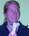
I think the composition works well in this shot. It is cropped so that her face fills the frame and the stick of butter helps to lead from the bottom of the frame up to her face. I think if anything were to be changed, it may be to allow more of her hand to show, instead of chopping it off.

TECHNIQUE
I will not mention the color except to say maybe the white balance was off? However, it seems that the butter is accurately colored. And the rest of the picture is a little off, leading me to believe it may be intentional.
I really like the color of the background, as it is a pleasant switch from the typical white or black. Also the shadow up the right side of her is a little harsh, making me think you used a flash. Since she is the only subject, and the background is empty, could you have used a smaller aperture number, and not have used the flash? OR sit a light behind her to block some of that. I really like the animated look you have captured; she looks completely natural, as if she is enjoying her typical afternoon snack!

OVERALL EFFECT
Umm, as for a picture, it looks a little contrived, BUT "got milk" shots aren't typically what you would shot for a portfolio anyway, so that factor doesn't bother me. Just mentioned because sometimes it may be better to get a little more natural. (I promise, this is just a thought and not a complaint, etc). Again, the look on her face spreads joy, I think, and I find it interesting that you have her eating butter. At least I hope you staged that and she doesn't do that regularly. A stick of butter at a time couldn't be healthy.
Photographer found comment helpful.
Pages:   ... ...
Showing 91 - 100 of ~320


Home - Challenges - Community - League - Photos - Cameras - Lenses - Learn - Help - Terms of Use - Privacy - Top ^
DPChallenge, and website content and design, Copyright © 2001-2025 Challenging Technologies, LLC.
All digital photo copyrights belong to the photographers and may not be used without permission.
Current Server Time: 06/16/2025 03:53:46 AM EDT.