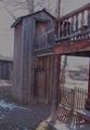
DPChallenge: A Digital Photography Contest You are not logged in. (log in or register
 
Browse Settings
Currently viewing:
Registered Userlinda12201

Show comments:

Per page:

Order:

Comments:


Comments Received by linda12201
Pages:   ...
Showing 201 - 210 of ~244
Image Comment
Two by Two
11/24/2005 09:02:28 PM
Two by Two
by linda12201

Comment by rick13601:
This pic reminds me of a 2 story outhouse. The students use the bottom and the teachers use the top. :-)
Photographer found comment helpful.
Two by Two
11/24/2005 11:28:41 AM
Two by Two
by linda12201

Comment by Dseale:
Think I've seen that house somewhere before. Prolly on here.
Photographer found comment helpful.
Two by Two
11/23/2005 06:59:05 PM
Two by Two
by linda12201

Comment by kevrobertson:
Nice effect, The uneven horizon is a little distracting. But i stil like the shot.
Good luck

Kev
Photographer found comment helpful.
Two by Two
11/23/2005 02:28:57 PM
Two by Two
by linda12201

Comment by catn:
Interesting concept, however, this picture looks like it could use more focus and brightness...
Photographer found comment helpful.
Two by Two
11/23/2005 10:55:09 AM
Two by Two
by linda12201

Comment by GrayGhost:
Interesting structure and composition, I especially like the shaped balusters. Low saturation gives an appropriate feeling, but I think that you need to compensate by bumping up the contrast.
Photographer found comment helpful.
Two by Two
11/23/2005 05:45:57 AM
Two by Two
by linda12201

Comment by wrobel:
The pigeon and the perch? 8
Photographer found comment helpful.
Ye Ole' Homestead
11/21/2005 05:20:12 PM
Ye Ole' Homestead
by linda12201

Comment by CEJ:
Hello from the Critique Club!

I have studied your image and have the following to offer:

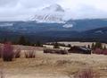
Composition/perspective – first observationsâ€Â¦this image has a lot of scenery to look at; the peak is centered; the cabin is just off a good thirds line. Now that all said, I think a slightly different crop either to the left or right would fix most of that. The side would depend on how much image you already cropped. Putting the mountain to one side or the other would help the placement of the cabin. Cropping some off the bottom would eliminate some of the clutter and distractions. The focus seems a little soft or perhaps some sharpening. There is a lot of texture in this image that could be brought out more. The perspective of the shot is excellent. The downward slope leads you into the shot while the sweeping valley in the mid section takes you right to the mountain. Very nice flow.

Color – the palette here is very rich in earthy tones with real nice tonal qualities. Some work with levels, contrast would bring those out more. The reds are a very nice contrast to the tans and browns of the grass. The greens and blues are a real nice lead into the whites and grays of the mountain and sky.

Light – very good use of natural lighting. The right time of day with the right conditions. This helps develop the textures (see above) that are all over this image. The balance between dark and light areas in the scene is very well done.

Challenge requirements – this certainly meets the challenge requirements very well. This is an exceptional landscape scene and one that should be hung somewhere.

Overall/my opinion – great image that I think fell short in the post processing. Everything I see in this image that I commented on can be fixed. I would be interested in seeing any reworks you do of this. The scene is very captivating and is a beautiful landscape image.
Photographer found comment helpful.
Ye Ole' Homestead
11/15/2005 11:55:10 PM
Ye Ole' Homestead
by linda12201

Comment by chgmeister:
needs more color satuation and contrast, subject is too centered, crop a bit off the right and bottom, and you've got a great photo.
Ye Ole' Homestead
11/15/2005 10:44:55 PM
Ye Ole' Homestead
by linda12201

Comment by graphicfunk:
Slightly weak in the very front otherwise a beautiful image with that melting mountain. Very nice. 7
Ye Ole' Homestead
11/15/2005 08:07:27 PM
Ye Ole' Homestead
by linda12201

Comment by seriocomic:
increasing the contrast on this shot would have made it much more dramatic, good luck
Pages:   ...
Showing 201 - 210 of ~244


Home - Challenges - Community - League - Photos - Cameras - Lenses - Learn - Help - Terms of Use - Privacy - Top ^
DPChallenge, and website content and design, Copyright © 2001-2025 Challenging Technologies, LLC.
All digital photo copyrights belong to the photographers and may not be used without permission.
Current Server Time: 08/24/2025 10:44:52 AM EDT.