| Image |
Comment |
| 01/26/2003 08:15:33 PM |
Riu Ripollby bcncrazyComment by ambaker: Critique Club Review
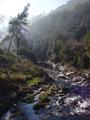
I like this photo a lot. The haze makes for a dreamy quality as the light filters past the tree. The stream does a good job of leading the eye to the top of the picture, it is a shame there isn't a bit more there. With the haze and the washed out sky, more trees to filter the light and create streamers would have worked quite well.
The lens flare is the only real distracting element. A lens hood or a helpfull hand shading the lens would have been very beneficial here.
The exposure was about as good as you could get under these conditions. Had you gone much darker and you would have lost the detail in the shadows at the lower left of the frame. Any brighter and the sky have overwhelmed the picture. Contrast is excellent, focus is good, possibly could have been a tiny bit sharper. |
| 01/25/2003 10:50:51 AM |
|
| 01/24/2003 09:30:23 PM |
|
| 01/24/2003 06:21:33 PM |
Riu Ripollby bcncrazyComment by timj351: I really wanted to like this photo because it seems to have a lot of the right elements like sunny weather, a river, rocks and greenery but instead it feels too cluttered. It doesn't have a focal point, my eyes just keep wandering around without really enjoy any one thing in particular. I think there probably was something good to photograph at this location but this particular composition just isn't working for me. Of course without knowing the location I can't really recommend a better composition. Was there a cleaner looking part of the river? Was there an angle that showed more of the beautiful trees? It's often a little tricky to shoot into the sun so as to avoid a washed out sky or lens flare. Maybe you could have pursued that element and showed the sun even more for a real striking shot by positioning the sun directly behind a tree or other object or something like that. Technically it is pretty good, fairly clean and sharp. For this particular shot the photo may have benefitted by underexposing it about a 1/2 to 1 full stop to maintain more of the color in the trees and grass. Like I said many of the right elements are there it just needed a better composition and some elements of emphasis. It looks like a fun area to explorer.
Tim
Critique Club |
 Photographer found comment helpful. Photographer found comment helpful. |
| 01/24/2003 04:52:18 AM |
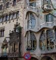
Signs by Antoni Gaudiby bcncrazyComment by Harz_Joerg: I like the architecture of Gaudi a lot: it's so different to anything else. Only Hunderwasser-buliding can reach him a little, although the styles is of course different.
To your picture: In my opinion you should have saved this treasure for a different challenge, where it fits better. In this building there are so many things that almost every challenge is suited. Hover, road-signs do not fit too well: the no-parking sign is in my view only disturbing and I would not call a building a road-sign.
For presenting the building itself, the composition should be changed: the tree-branches on the right side disturbe, on the left side not. A closer point of view, more of the Gaudi-building and the use of a different angle of view would have made the picture more interesting.
|
| 01/24/2003 12:53:28 AM |
Signs by Antoni Gaudiby bcncrazyComment by Wheeler1992: I don't feel (as a viewer) that the sign is the primary focus of the picture. It is a beautiful building but beautiful buildings in not the subject |
| 01/23/2003 11:32:17 PM |
|
| 01/23/2003 11:09:40 AM |
Signs by Antoni Gaudiby bcncrazyComment by inspzil: What an amazing building. The sign takes away a lot from the building, if it didn't have to be there. Extraordinary. Did you try this in black and white? Just curious - Love the shot. - Inspzil |
| 01/23/2003 08:08:23 AM |
|
| 01/22/2003 11:50:17 PM |
Signs by Antoni Gaudiby bcncrazyComment by Annida: I love the building in this photograph :) it's a very different structure. It just looks like the sign was thrown in as an afterthought.I think if maybe you had been able to concentrate more on the sign and maybe the windows above it, it may have been a much more successful photograph -Annida |
Home -
Challenges -
Community -
League -
Photos -
Cameras -
Lenses -
Learn -
Help -
Terms of Use -
Privacy -
Top ^
DPChallenge, and website content and design, Copyright © 2001-2026 Challenging Technologies, LLC.
All digital photo copyrights belong to the photographers and may not be used without permission.
Current Server Time: 07/16/2026 06:10:59 AM EDT.