| Image |
Comment |
| 09/18/2009 09:06:34 PM |
|
 Photographer found comment helpful. Photographer found comment helpful. |
| 09/16/2009 09:23:52 PM |
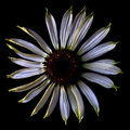
Rudbeckiaby korpenComment by JacksonGariety: Great flower, wish I could see the middle a bit better. Offset angle bothers me, but I love the photo so much Ill just look past it. good job! 6 |
| Photographer found comment helpful. |
| 09/16/2009 05:42:33 PM |
|
| Photographer found comment helpful. |
| 09/15/2009 11:06:28 PM |
Rudbeckiaby korpenComment by Yo_Spiff: The treatment works well, making the fine veins of the petals into the star of this shot. I'm not a huge floral fan, but I can recognize well done, nonetheless. |
| Photographer found comment helpful. |
| 09/15/2009 02:28:07 PM |
Rudbeckiaby korpenComment by K3Master: I shall be rating this challenge by the following criteria:
1 - Not HDR in my opinion
3 - HDR is way over-done, in my opinion
5 - A reasonable use of HDR, but not a very engaging photo, in my opinion
7 - A reasonable use of HDR, and an engaging photo, in my opinion
10 - A fantastic use of HDR, and an out of this world photo, in my opinion
Your photo receives:
1 |
| Photographer found comment helpful. |
| 09/15/2009 02:17:56 PM |
|
| Photographer found comment helpful. |
| 09/15/2009 12:19:50 AM |
|
| Photographer found comment helpful. |
| 09/14/2009 09:49:47 PM |
|
| Photographer found comment helpful. |
| 09/14/2009 08:35:29 AM |
|
| Photographer found comment helpful. |
| 08/03/2009 04:51:08 PM |
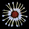
crazydaisyby korpenComment by MistyMucky: Greetings from the Critique Club :)
My first impression was of strong weirdness. It comes mainly from the irregular radial angles and is reinforced by the rolled-up petal and the faded colors. The square composition delimiting the round flower makes the irregularity of the petal even more obvious than any other composition would be. All this conveys perfectly well the trait of craziness you needed from your chosen username.
The technical execution of this photo is perfect, as far as I can tell. However, I am not sure if HDR was useful here. Unlike your entry in Flowers II, where you visibly increased the range of color tones, the effect is more subtle here. The first time I saw your image was on a cheap LCD monitor and the colors looked terribly flat. The second time was on a high-end screen and it looks fine. HDR seems dangerous to me for web publishing, if not used in order to achieve tones with higher contrast.
I think you took the challenge seriously and created a meaningful picture. In other words, you produced a very fine piece of art, where every element fits neatly together and creates an original mood. I guess you knew before entering that it is not necessarily the most DPC-friendly of subjects, therefore your nonetheless respectable score shows that it is very well done!
If you have any questions about this critique, please PM me.
Mike
|
| Photographer found comment helpful. |
Home -
Challenges -
Community -
League -
Photos -
Cameras -
Lenses -
Learn -
Help -
Terms of Use -
Privacy -
Top ^
DPChallenge, and website content and design, Copyright © 2001-2026 Challenging Technologies, LLC.
All digital photo copyrights belong to the photographers and may not be used without permission.
Current Server Time: 05/06/2026 06:09:05 PM EDT.