| Author | Thread |
|
|
08/03/2009 04:51:08 PM |
Greetings from the Critique Club :)
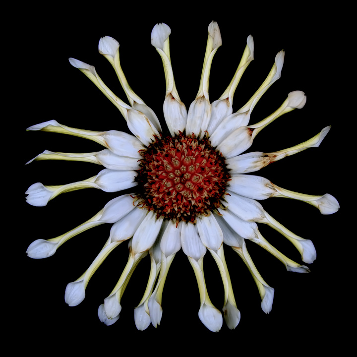
My first impression was of strong weirdness. It comes mainly from the irregular radial angles and is reinforced by the rolled-up petal and the faded colors. The square composition delimiting the round flower makes the irregularity of the petal even more obvious than any other composition would be. All this conveys perfectly well the trait of craziness you needed from your chosen username.
The technical execution of this photo is perfect, as far as I can tell. However, I am not sure if HDR was useful here. Unlike your entry in Flowers II, where you visibly increased the range of color tones, the effect is more subtle here. The first time I saw your image was on a cheap LCD monitor and the colors looked terribly flat. The second time was on a high-end screen and it looks fine. HDR seems dangerous to me for web publishing, if not used in order to achieve tones with higher contrast.
I think you took the challenge seriously and created a meaningful picture. In other words, you produced a very fine piece of art, where every element fits neatly together and creates an original mood. I guess you knew before entering that it is not necessarily the most DPC-friendly of subjects, therefore your nonetheless respectable score shows that it is very well done!
If you have any questions about this critique, please PM me.
Mike
|
|
 Photographer found comment helpful. Photographer found comment helpful. |
Comments Made During the Challenge  |
|
|
07/30/2009 04:07:41 PM |
|
An amazing flower fits the user well... |
|
| Photographer found comment helpful. |
|
|
07/27/2009 08:28:32 PM |
|
The centered circular composition inside of the square format is really appealing. The curled up petals gives a whimsical feel to the photo. |
|
| Photographer found comment helpful. |
Home -
Challenges -
Community -
League -
Photos -
Cameras -
Lenses -
Learn -
Help -
Terms of Use -
Privacy -
Top ^
DPChallenge, and website content and design, Copyright © 2001-2026 Challenging Technologies, LLC.
All digital photo copyrights belong to the photographers and may not be used without permission.
Current Server Time: 06/28/2026 11:58:09 PM EDT.