| Image |
Comment |
| 04/26/2006 12:34:41 PM |
|
 Photographer found comment helpful. Photographer found comment helpful. |
| 04/26/2006 07:16:21 AM |
|
| Photographer found comment helpful. |
| 04/26/2006 06:54:03 AM |
|
| Photographer found comment helpful. |
| 04/26/2006 06:01:21 AM |
Flower and Vaseby MattOComment by macrothing: 4 - Nice concept. Looks crooked. A more uniform or varied base and background/drop and possibly also a better arrangement of the flowers (unless this is intentional) make this better in my opinion. Less glare on the vase too. Colors are good in the flowers, including the match up of the stems with the vase. |
| Photographer found comment helpful. |
| 04/20/2006 12:36:21 PM |
Storytime friendsby MattOComment by kirsty_mcn: woah, i was surprised at the low score this got, its a nice composition and really cute. The toys do blend in with the b/g , like a1275 pointed out, but also it seems as though the focus on the child aint perfect. But overall I'm sure its underrated |
| Photographer found comment helpful. |
| 04/20/2006 12:55:02 AM |
.......for big boys, gone wrongby MattOComment by eschelar: There's almost a sort of tranquility here. The stopping of motion becomes a part of the picture that is not just a photographic characteristic. Neat shot. I love that spring flying around all by itself. To me, it makes the photograph. |
| Photographer found comment helpful. |
| 04/19/2006 06:07:02 PM |
Spring colorsby MattOComment by kirsty_mcn: I think the very shallow dof would work more effectively with a tighter crop, because as it is, the entire right half is oof, and the sharpest part, on the stamens, is bang on centre. Its difficult with daffodils, 'cause they can get kinda boring close up, just lots of yellow but maybe you could give it something else by harsher lighting, to bring out the textures Message edited by author 2006-04-20 12:31:04. |
| Photographer found comment helpful. |
| 04/12/2006 07:09:48 AM |
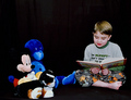
Storytime friendsby MattOComment by L2: Hi Matt! What a little cutie your little boy is - a natural in front of the camera. This was a good idea, but I think the black background hurt you a little bit, because it has more of a colder feel to it than I might expect for "bedtime story-time." Exposure seems to just a little bit off, too, as the black of Mickey's ears are getting lost in the background as well. Great facial expression on your son - you can tell he's having fun reading the story to his "friends." |
| Photographer found comment helpful. |
| 04/12/2006 04:42:31 AM |
|
| Photographer found comment helpful. |
| 04/11/2006 01:31:00 AM |
|
| Photographer found comment helpful. |
Home -
Challenges -
Community -
League -
Photos -
Cameras -
Lenses -
Learn -
Help -
Terms of Use -
Privacy -
Top ^
DPChallenge, and website content and design, Copyright © 2001-2026 Challenging Technologies, LLC.
All digital photo copyrights belong to the photographers and may not be used without permission.
Current Server Time: 07/16/2026 11:15:48 PM EDT.