| Image |
Comment |
| 02/03/2003 01:36:57 PM |
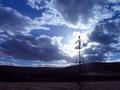
Brokenby PtmanComment by thatguy: This is a good image. The the windmill with the sunlight going through it makes this picture. |
| 02/03/2003 08:38:21 AM |
|
| 02/03/2003 12:59:20 AM |
|
| 02/02/2003 08:06:23 PM |
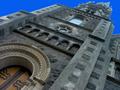
Inspiredby PtmanComment by bod: I love the angle you've used to get this in the frame, and the colour & detail on the door and arch are fantastic, but I really don't like the sky. It looks totally false and doesn't fit the picture comfortably. |
 Photographer found comment helpful. Photographer found comment helpful. |
| 02/02/2003 04:57:29 PM |
Inspiredby PtmanComment by PTLParsons: Love the angle looking up, but why the tilt? Not sure I like that. This is such a beautiful old church, it seem such a shame to ruin it by tilting the photo. I love the stone work. I just love the old building and the photo is beautiful, and well done - with that one exception. That tilt hurts me. |
| 02/02/2003 02:38:43 PM |
Inspiredby PtmanComment by lisae: Wow... it's weird when you take a photo from one angle and then rotate it. The distorted perspective has an odd effect.The subtle beauty of the colours and textures of this old building are a bit diminished by the artificially blue sky. |
| 02/02/2003 08:39:39 AM |
|
| 02/01/2003 10:33:05 PM |
|
| 01/31/2003 07:10:03 PM |
Inspiredby PtmanComment by Kaz: WOW!! You're making me really dizzy. Great angle, wonderful detail and texture. 10! |
| Photographer found comment helpful. |
| 01/31/2003 05:23:43 PM |
Strawberry Fareby PtmanComment by timj351: Critique Club critique
The colors here emmediately jumped out at me and made a good impression. They look natural without being over saturated. The composition is good but a little safe. In that I mean the overhead view with a pleasing arrangement is pretty common but that also means that it works well. The composition would be just fine to me if the lighting was more dramatic in some way. It appears flatter than it should be with too much ambient light. The ice cream and strawberries have very interesting forms that should be emphasized as much as possible. I would think one dominate light slight diffused on one side to produce a strong but soft shadows with a lesser light on the opposite side to reveal some detail in the shadows may work well. The amount of sharpness is right on and the image looks very clean. It is a very nice photo but some more emphasis on the forms would really make this a winner.
Tim Jensen |
| Photographer found comment helpful. |
Home -
Challenges -
Community -
League -
Photos -
Cameras -
Lenses -
Learn -
Help -
Terms of Use -
Privacy -
Top ^
DPChallenge, and website content and design, Copyright © 2001-2026 Challenging Technologies, LLC.
All digital photo copyrights belong to the photographers and may not be used without permission.
Current Server Time: 07/16/2026 02:35:10 PM EDT.