| Image |
Comment |
| 04/04/2003 11:53:20 AM |
|
 Photographer found comment helpful. Photographer found comment helpful. |
| 04/04/2003 08:02:55 AM |
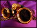
Night at the Operaby crabappl3Comment by kiwiness: Beautiful color combinations here. A wonderful macro, set up very well. 9 from me. (I'd be interested in knowing how you set up your lighting for this) |
| Photographer found comment helpful. |
| 04/02/2003 09:26:37 PM |
|
| Photographer found comment helpful. |
| 04/02/2003 04:56:29 PM |
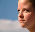
Contemptby crabappl3Comment by timj351: Critique Club critique by Tim Jensen
This is an interesting photo and I like it quite a bit. My one slight problem I have with it, though, is the fact that I don't see a lot of contempt in the girl's expression. Maybe it would if I knew her expressions. To me it simply looks like she is looking off intently at something. As a photo, in general, this is actually one of the elements that I enjoy about this photo. The other elements that I think are well done are the tight cropping, the simple blurred background, and the natural complimentary colors. These elements create an engaging photo by eliminating everything that isn't necessary. I enjoy portraits the most where the subject is looking away at something. This puts the emphasis squarely on the person and doesn't imply that there is someone with a camera nearby.
The overall lighting is very effective and I like the shadows cast by the girl's eyelashes. However, I find the shadow from her nose a little distracting and maybe some very subtle fill flash would have helped in that area.
Technically everything appears perfect with nice colors and appropriate sharpness. I see no evidence of jpeg artifacts and there is a pleasant smoothness to the girls skin and features. I am normally not in favor of a square format but I find it effective in this case.
Very nice job.
Tim |
| Photographer found comment helpful. |
| 04/02/2003 03:01:04 PM |
|
| 04/02/2003 10:04:47 AM |
Falling Downby crabappl3Comment by kiwiness: Good symmetry. The bubbling water gives this a wild effect. The light and shadows are parted in the middle too good one. 8. |
| Photographer found comment helpful. |
| 04/02/2003 05:44:47 AM |
Night at the Operaby crabappl3Comment by aussie: I absolutely love the colour co-ordination here. The brass (gold) against the purple/pink backdrop. Excellent clarity and composition. Very well captured and GL in this weeks challenge. |
| Photographer found comment helpful. |
| 04/01/2003 10:26:24 PM |
Falling Downby crabappl3Comment by joebar: Wow, super shot! Think it would have been even cooler if you did a longer exposure, to get more of the "flowing water" effect. That would have been sweet. Don't think the color of the border is right.. A bit to greeney. 8 |
| Photographer found comment helpful. |
| 04/01/2003 09:58:32 PM |
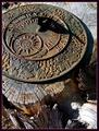
Timekeeperby crabappl3Comment by Annida: Hello from the Critique Club!
Hi Crabappl3!
I always loved antiquated time pieces, and darn if this isn't a good example of one. I like your choice of subject a lot. I also think your technical choices were good. But.. the light was just a tiny bit too harsh in my opinion.
Cropping is an issue with me on this photo as well. As much as I like the tree stump, I also think that it's distracting from the main subject. I would have (personally) prefered to see you focus more on the uhm sundial, and crop it more around that.
I like the deail you have managed to capture. Well done.
-Annida |
| Photographer found comment helpful. |
| 04/01/2003 05:41:33 PM |
|
| Photographer found comment helpful. |
Home -
Challenges -
Community -
League -
Photos -
Cameras -
Lenses -
Learn -
Help -
Terms of Use -
Privacy -
Top ^
DPChallenge, and website content and design, Copyright © 2001-2026 Challenging Technologies, LLC.
All digital photo copyrights belong to the photographers and may not be used without permission.
Current Server Time: 06/12/2026 07:44:19 PM EDT.