DPChallenge: A Digital Photography Contest You are not logged in. (log in or register
 
Browse Settings
Currently viewing:
Registered Usercrabappl3

Show comments:

Per page:

Order:

Comments:


Comments Received by crabappl3
Pages:   ... [328] [329] [330] [331] [332] [333] [334] ... [422]
Showing 3301 - 3310 of ~4213
Image Comment
Blues in the Night
05/07/2003 02:00:22 PM
Blues in the Night
by crabappl3

Comment by pesinn:
One of my favourites this time around. Extraordinary lighting... great color(s)! Good luck :) - 9
Photographer found comment helpful.
The Lonestar State
05/07/2003 01:27:08 PM
The Lonestar State
by crabappl3

Comment by K-Rob:
Simple, yet effective. Look very professional. - 10
Photographer found comment helpful.
Streetrod
05/07/2003 12:26:30 PM
Streetrod
by crabappl3

Comment by FranziskaLang:
A Comment From The Critique Club

Hi Danny!

Remember me? I'm your personal CCClub commenter ;) I like that role, too, because, as always, your image is very well done :)

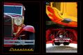
The red and yellow colors of the images are beautiful and nicely contrasted by the black background. I like that the left image instantly gives you a context for the two images on the right and that you have to look at them a little closer to figure out the angle that they were taken at. This way, you combine to get the instant impact that seems to be necessary to score well on DPC as well as the "hold the interest" aspect that is necessary for people to like images beyond the first impression.

The images themselves are very nice, not too many reflections, sharp, good contrast. The image on the left could be a tad lighter and (even though it is not), looks slightly tilted because of the curve of the roof I think.

Overall, I think the multi-image composition feels a little unbalanced to me. The left image is a lot cleaner and less "cluttered" (strong word, I can't think of a better one just now), while the two images on the right both have a lot going on and, on the very first glance, seem to be one image. Maybe separating them through a red border, too, would've helped that, or even just allowing a little more breathing space between the images.

I like the text and the title, the color goes well with the images and the font is just perfect for the old cars, and nicely repeats what is visible in the left image already.

In summary, your entry definitely meet the challenge, the photos tell a great story about beautiful old cars and I think many an old car fan could imagine this on their wall at home. Good work as usual, with only small areas of possible improvements.

Please let me know if you have any questions or comments about this review.

Until my next review of one of your entries, take care ... :)

Franziska.
Photographer found comment helpful.
Blues in the Night
05/07/2003 12:05:49 PM
Blues in the Night
by crabappl3

Comment by Pedro:
is that blue light or photoshop? I'm not a fan of borders in general, but it works here. nicely cropped too. 7
Photographer found comment helpful.
Blues in the Night
05/07/2003 10:55:42 AM
Blues in the Night
by crabappl3

Comment by tyrkinn:
Great shade of blue, and the framing is better than I've seen elsewere today. Good job.
Photographer found comment helpful.
Blues in the Night
05/07/2003 10:33:45 AM
Blues in the Night
by crabappl3

Comment by Gordon:
It's upside down! Very spooky/ threatening. I feel like the aliens are landing.

I like the small blue glints at the top of the shot too.
Photographer found comment helpful.
Blues in the Night
05/07/2003 09:29:10 AM
Blues in the Night
by crabappl3

Comment by eloise:
The contrast is so extreme/shot is so dark that it's almost hard to make out what's going on.
Digitally Photograph the WORLD weekly!
05/07/2003 08:54:01 AM
Digitally Photograph the WORLD weekly!
by crabappl3

Comment by KarenB:
I like the catch phrase.... interesting that you used a yellow ribbon..lol Go for Blue! LOL
Photographer found comment helpful.
Blues in the Night
05/07/2003 08:02:34 AM
Blues in the Night
by crabappl3

Comment by Denise Catania:
my favorite color..very nice
Photographer found comment helpful.
Blues in the Night
05/07/2003 03:37:13 AM
Blues in the Night
by crabappl3

Comment by frozensun:
i like the lighting and thr transparency from the bottom! i hope u'll get high ranks
Photographer found comment helpful.
Pages:   ... [328] [329] [330] [331] [332] [333] [334] ... [422]
Showing 3301 - 3310 of ~4213


Home - Challenges - Community - League - Photos - Cameras - Lenses - Learn - Help - Terms of Use - Privacy - Top ^
DPChallenge, and website content and design, Copyright © 2001-2025 Challenging Technologies, LLC.
All digital photo copyrights belong to the photographers and may not be used without permission.
Current Server Time: 09/16/2025 07:42:07 AM EDT.