Bridge Symmetryby
manic35Comment by SJCarter: * Greetings from the Critique Club *
First Impression - the most important one:
Well, I scored this an 8 during the challenge. My first impression was obviously a very positive one. With a score above 6.2, the majority of voters must have felt the same way! That being said and upon closer inspection (and after reading the other comments given), I will do my best to provide some constructive feedback. [Next time it might help the CC if you also left some photographer comments regarding your intentions, post-processing steps, etc. - Thanks!]
Composition:
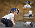
Some mixed messages from commenters on your composition here. I definitely see the symmetry - nice job there. Certainly very strong shapes that compliment each other in a very visually appealing manner. My only real nit with your composition is the apparent slight tilt of the horizon. Whether or not it is actually the case, the illusion is there (at least to me and is one of the reasons I didn't score this a 10). I understand that the left-most support looks perpendicular, but the uphill slope of the wall, the slant of the right-hand support, and buildings in the background throw the rest of the shot off balance. I think with a very slight adjustment to the horizon line, this would have corrected it and increased your already high score. Otherwise, great lines, shapes, etc.
Subject:
The subject matter was right on topic and couldn't have been more relevant to the challenge theme IMHO.
Technical (Color, focus, and light):
There were some differences of opinion again with regard to some of the technical aspects of the shot. Personally, I think that your choice of tones was excellent. It strayed from the normal B/W or duotone, and added a complimentary flavor to the mood of the image. Your lighting control was especially good. I think you managed to eke out a wide range of tonal quality without going overboard at either end of the spectrum. With regard to the color and DOF, I do see that there were some people who would have preferred a different approach, but I view this as more personal taste than whether or not this particular shot was executed well.
To grow its vote?:
Little things as stated above. Personal tastes and a few minor details would have probably landed this a little higher on the scoring ladder (although there wasn't a whole lot more room for it to rise).
Summary:
Great job and I look forward to seeing more of your work.
Just my 2 cents...
Jimmy