| Image |
Comment |
| 08/02/2006 01:11:18 AM |
The Aviatorsby LERtasticComment by DrAchoo: I don't think this is a bad shot. I do like the reflections. It's a nice touch. Other than the glasses, the rest of the face is soft. I'm not quite sure why, whether it is DOF or just a soft lens. Maybe it's processing. Either way, I don't like it. I also think the glare on his skin is a bit too much. It reveals that the whole picture has been shifted as his skin tone is very, very yellow. Not the most flattering.
On the good side, the composition is well done and I like the added feature of the blinds in the back. The lines add some extra pizzazz to the shot. |
 Photographer found comment helpful. Photographer found comment helpful. |
| 07/31/2006 06:43:33 AM |
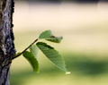
The Childby LERtasticComment by talj: Nice idea, I would like to have seen more of the leaves in focus but I like the B/G blur |
| Photographer found comment helpful. |
| 07/30/2006 10:18:32 PM |
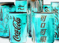
Multicultural City of Cokeby LERtasticComment by TooCool: From the Critique Club:
First of all, let me preface by saying that I'm not a big fan of abstracts. I understand their appeal, they're just not my cup of tea. That said...
This shot, though kinda cool, just doesn't look like an abstract to this viewer. I love the tones that you achieved by inverting the shot but inverting doesn't equal abstract. I think that and the fact that Coke really ain't a food is what took away from your score for this challenge. Now if this was a beverage challenge or a blue (green? I have some color issues) challenge, this would be the bomb!
Yours
TC |
| Photographer found comment helpful. |
| 07/30/2006 02:26:01 PM |
|
| Photographer found comment helpful. |
| 07/28/2006 06:36:44 PM |
Golden Streaksby LERtasticComment by RiderGal: great subject to fit the challenge... she has beautiful eyes and the hair just works here... I think however you could have made a better image here than you have. for one... watch out for your background... you have a (bed post?) going right through her head...which takes away from the image... also even if this is a candid... you might have stepped one step to the left or at least gotten down or up instead of what looks like a fairly straight on shot. - 6- |
| Photographer found comment helpful. |
| 07/27/2006 04:37:10 PM |
The Aviatorsby LERtasticComment by Revecca: I like this.
I like the fact that I can't really see your reflection or if I can, at least it's not noticeable.
the overall color of this pictyre is very pretty..
but the expression on this face [mouth] is odd. |
| Photographer found comment helpful. |
| 07/27/2006 04:09:56 PM |
|
| Photographer found comment helpful. |
| 07/27/2006 09:30:46 AM |
The Aviatorsby LERtasticComment by TrynityRose: The composition is good, the only thing I'm not liking is the white band along the background. You couldnt have cropped so maybe changing up the angle when you shot may have avoided it. As it is it pulls my eye a little and disturbs the continuation of the gold theme. |
| Photographer found comment helpful. |
| 07/27/2006 09:23:33 AM |
|
| Photographer found comment helpful. |
| 07/26/2006 10:54:03 PM |
The Aviatorsby LERtasticComment by JulieG: The reflections are very cool. The rest of his face could be a tad sharper, but maybe that would detract from the reflections, I don't know |
| Photographer found comment helpful. |
Home -
Challenges -
Community -
League -
Photos -
Cameras -
Lenses -
Learn -
Help -
Terms of Use -
Privacy -
Top ^
DPChallenge, and website content and design, Copyright © 2001-2026 Challenging Technologies, LLC.
All digital photo copyrights belong to the photographers and may not be used without permission.
Current Server Time: 06/21/2026 03:56:05 AM EDT.