| Image |
Comment |
| 04/29/2006 02:22:48 PM |
|
| 04/29/2006 02:05:46 PM |
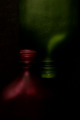
SYMMETRYby imagesloyolaComment by elsapo: This is very interesting and artistic! I love the darkness and symmetry... Hope it does good ;) |
| 04/29/2006 12:42:54 PM |
SYMMETRYby imagesloyolaComment by Artyste: *I am only commenting, and not voting on this challenge*
Dark and moody lighting which works well for me. Red/Green is my least favorite of the CC, but this one really works.. it has a shade of green that doesn't knock you over the head, and the red is almost calming. Unfortunately, your crop leaves the symmetry a *little* bit off, which will probably cause people to hit you a bit. Nice photo otherwise. |
| 04/29/2006 11:03:07 AM |
|
| 04/28/2006 04:57:57 PM |
|
| 04/28/2006 02:39:59 AM |
SYMMETRYby imagesloyolaComment by lfordhere: There is all kinds of noise in this photo, and it is a bit dark too. I don't know what the subject is, and perhaps I'm not supposed to, but the colors are pretty and I want to see more of them. 3 |
| 04/27/2006 04:15:31 PM |
|
| 04/27/2006 01:42:25 PM |
|
| 04/27/2006 08:11:38 AM |
|
| 04/26/2006 09:07:52 PM |
SYMMETRYby imagesloyolaComment by macrothing: 4 - Colors are nice. Obviously dark overall but seems intentional. Your title draws attention to whether this is symmetrical or not, and it is slightly off, but fairly minor. Composition works well. edit:typo Message edited by author 2006-07-04 15:56:10. |
Home -
Challenges -
Community -
League -
Photos -
Cameras -
Lenses -
Learn -
Help -
Terms of Use -
Privacy -
Top ^
DPChallenge, and website content and design, Copyright © 2001-2026 Challenging Technologies, LLC.
All digital photo copyrights belong to the photographers and may not be used without permission.
Current Server Time: 07/16/2026 04:56:33 PM EDT.