| Image |
Comment |
| 06/18/2006 02:31:33 PM |
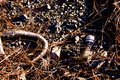
Buried Treasure (Human Impact)by kari1Comment by SJCarter: I like this shot, although it's a tad on the dark side. I would probably do a little selective dodging/burning to brighten it up a bit and bring out some more of the contrast. However, I have a tendency to overdo that sort of thing... ;-) Love the statement this makes - so true... Well seen and captured. |
 Photographer found comment helpful. Photographer found comment helpful. |
| 06/18/2006 06:07:14 AM |
|
| Photographer found comment helpful. |
| 06/09/2006 01:22:05 PM |
sunflower cropped 379.jpgby kari1Comment by alien2thisworld: I love studio flower shots. I think I would prefer a little bit different lighting on this shot to bring out the yellows a little more. There seems to be a pretty bright spot on the stem just below the flower, and my eye keeps being distracted by it. The center of the flower is pretty dark. I think if the light were coming from above, it would add more interest in the middle of the flower and brighten up all the petals nicely. I think the composition is good and the focus looks fine too. |
| Photographer found comment helpful. |
| 06/09/2006 02:21:02 AM |
Tulipsby kari1Comment by amber: Hi from the Critique Club!
The first thing I notice about your image is the fantastic use of colour. The expanse of black as a background does not over-dominate, but enhances the soft pastel shades of orange and green.
The three flowers are beautifully placed. There are lovely curves that converge to one point at the bottom of the image, with lovely negative space in between. This gives a feeling of calm, serenity and beauty. There is an overall balance in the composition that is really pleasing on the eye.
Theree is lovely contrast between the lighting on the top and bottom of the tulips. I do though find it a little harsh on the bottom flower, but not so much that it spoils the image for me.
The image is very soft, and I would loved to have seen a just a little more detail in the petals. There is though more of a hint of texture on the the stems, which is nice.
I also think such a lovely image deserves more than the title 'Tulips'..I would have called it 'Threelips' or 'Trinity':)) |
| Photographer found comment helpful. |
| 06/07/2006 03:30:33 AM |
Tulipsby kari1Comment by Leok: Nice work Kari, congratulations on your score. The lighting was artfully controlled. It was nice to meet you the other day too.
Leo |
| Photographer found comment helpful. |
| 06/07/2006 02:45:14 AM |
|
| Photographer found comment helpful. |
| 06/07/2006 01:34:02 AM |
Tulipsby kari1Comment by joynim: Outstanding and well deserved :-) Keep up the good work! |
| Photographer found comment helpful. |
| 06/06/2006 08:22:41 PM |
Tulipsby kari1Comment by GT350: Wonderful composition. I like the softness that is conveyed in the shot. I like the square crop. |
| Photographer found comment helpful. |
| 06/06/2006 03:59:42 PM |
|
| Photographer found comment helpful. |
| 06/06/2006 01:19:01 AM |
Tulipsby kari1Comment by MTPixels: This a top pick of mine for this challenge thus far. Very classy photograph. The colors and lighting are right on the money and the contrast of the dark background works well here. |
| Photographer found comment helpful. |
Home -
Challenges -
Community -
League -
Photos -
Cameras -
Lenses -
Learn -
Help -
Terms of Use -
Privacy -
Top ^
DPChallenge, and website content and design, Copyright © 2001-2026 Challenging Technologies, LLC.
All digital photo copyrights belong to the photographers and may not be used without permission.
Current Server Time: 07/16/2026 02:25:34 PM EDT.