| Image |
Comment |
| 09/28/2005 04:00:04 PM |
|
 Photographer found comment helpful. Photographer found comment helpful. |
| 09/28/2005 11:21:27 AM |
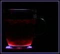
Fruit Tea Firewaterby kari1Comment by DrAchoo: I wanna say you want a tiny bit more exposure, but I know what you are trying to go for. it's soothing though and I like that. 7 |
| Photographer found comment helpful. |
| 09/28/2005 03:30:12 AM |
|
| Photographer found comment helpful. |
| 09/27/2005 05:16:48 AM |
|
| Photographer found comment helpful. |
| 09/24/2005 05:58:48 PM |
A Legal Perspectiveby kari1Comment by strangeghost: Greetings from the Critique Club
by strangeghost
COMPOSITION
My initial feeling is that, while a decent enough shot, it lacks a clear point of focus to draw my interest. The "school of law" seems to be well placed, but the way it curves out of easy visual range makes it feel like it just fizzles out. Likewise, the interesting windows are arranged in lines that lead the eye to the edge of the photo, but again, lack a balanced or harmonious feel.
TECHNIQUE
The main impression here is of a somewhat monochromatic image, with relatively low contrast. The grays really rule the day. Bumping the contrast up a bit may have paid off. I think the reflections in the lower windows are particularly unfortunate, since they add a bit of additional detail that fails to add any interest. Focus is sharp, but without any key element that draws the eye, it's technical adequacy without emotional impact.
OVERALL IMPACT
Pretty flat, I think. It's an attractive enough building, but I think you didn't find the pleasing angles or lines that would have really made it a 'wow' photo. Keep browsing the architectural photos on this site and others. Watch for how people make dramatic use of light, shadow, angles and perspective to add punch. |
| Photographer found comment helpful. |
| 09/24/2005 12:16:23 PM |
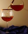
Making bubbles ...by kari1Comment by hanneke: Maybe next time you should try (my thoughts) to get a clear background (black / white / etc) I like the idea though! |
| Photographer found comment helpful. |
| 09/22/2005 03:42:01 PM |
Making bubbles ...by kari1Comment by LevT: nice composition, but the background wall is unappealing. Should have either blur it by shallowe dof or replace by something else. |
| Photographer found comment helpful. |
| 09/22/2005 12:00:09 AM |
|
| Photographer found comment helpful. |
| 09/21/2005 12:26:08 PM |
|
| Photographer found comment helpful. |
| 09/21/2005 12:02:23 PM |
Making bubbles ...by kari1Comment by CNovack: The idea is good but the execution could be better. I like how you use the element of the wine and the wine glasses but I think this entry could have been much stronger if you had zoomed in on your focus. There is too much background that is distracting the eye from the main focus and that is the bubbles in the wine glass. If you zoomed in on just one wine glass where we just see half of it in the picture you would have the pleasing curve of the glass for the eye to look at and study. The viewer would also see the stream of wine being poured into the glass and the bubbles that result from that action. Also the reds of the wine could be deeper and more rich in hue if you used a black background. |
| Photographer found comment helpful. |
Home -
Challenges -
Community -
League -
Photos -
Cameras -
Lenses -
Learn -
Help -
Terms of Use -
Privacy -
Top ^
DPChallenge, and website content and design, Copyright © 2001-2026 Challenging Technologies, LLC.
All digital photo copyrights belong to the photographers and may not be used without permission.
Current Server Time: 07/17/2026 12:33:33 AM EDT.