| Image |
Comment |
| 07/01/2006 09:59:55 PM |
pencil shavings.JPGby wavelengthComment by alfresco: Initial Reaction
Interesting, tres interesting. I like.
Technicals
I think we need some more contrast here, things seem stuck in the middle tonal range. It also feels like the white balance isn't quite on, perhaps a tad too yellow. A pass of SS (or USM of
Aesthetics
I _love_ the use of shapes. We have a straight pencil, skewed to it (excellently so) are straight lines of the paper, then we have curves of the shavings, but not only that the wonderful ridges all of us not-using-pencils-for-decades people forgot all about. Add the bits o' lead and we're talking excellent elements.
--- Intermission ---
So I'm down at Canyon Falls today photographing the falls (huh). I'm down in the unused by-the-water-suck-place-to-get; as I'm getting ready to haul my fat @$$ back up the side of the cliff a guy carrying a bag plops on down in front of me. Yadda yadda yadda he pulls out a homemade pinhole camera! So I documented his pinhole documentation of the falls ... yadda yadda yadda I tell him watching him makes me feel like I'm cheating with the digital. His respone, "Naaaa, it's all photography".
--- End Intermission ---
Composition
I think we're 90% there and a slight adjustment would send this over the top, for me eyeflow isn't making use of the elements. I think if the pencil were left-shifted a bit and the main bit of shavings were right-shifted a tad we'd have great leading lines. Orienting the shavings so the curling nature leads us back to the pencil (which then takes us through the image again) would be icing on the cake. Movement amounts: the pencil tip one line (give or take), the shaving about two lines (give or take).
Bottom line
A couple of minor changes would make this a zip-dinger, overall I like it :) |
 Photographer found comment helpful. Photographer found comment helpful. |
| 07/01/2006 09:54:04 PM |
Hannahby wavelengthComment by yanko: Wow, this is a nice portrait. The clarity is really good and you didn't go crazy oversharpening it like I probably would have. The complementary colors are there but I also like how the pattern on the blouse has heart. Hearts and flowers to me are very complementary so there is that extra element present here.
If you were to reshoot this I would think about centering her in the middle. Right now you have her a bit to the left. If you want to go that route then maybe shoot landscape and have more negative space? However, I do like the portrait style especially how her hair fills the frame. Also, maybe use flowers that are a bit straight. Those look like they are wilting a bit but the color in them is very pleasing. All in all a great photo and one that met the challenge, IMO. |
| Photographer found comment helpful. |
| 07/01/2006 09:42:19 PM |
DSC_9143.jpgby wavelengthComment by yanko: I really like the way you composed this with the diagonal lines and off centered subject. The image looks good as is but also has lots of potiental in photoshop especially with shadow/highlights adjustments. I think you can make the detail in this one really come out using it among other things. |
| Photographer found comment helpful. |
| 07/01/2006 09:38:59 PM |
DSC_9137.jpgby wavelengthComment by yanko: I like this one. The desaturated sky really helps to make the subject stand out. The detail in the rocks also add strong interest. Good tonal range through out. |
| Photographer found comment helpful. |
| 07/01/2006 09:28:13 PM |
PICT7741.jpgby wavelengthComment by posthumous: Whenever I see a mother and son shot it reminds me of the madonna with child genre of art. Every detail has siginificance, the position of the two figures, what each is doing, the expressions on their faces. This one is pure bliss. More remarkable than the loving smile of the mother figure is the expression of pure happiness on the child. Also notice how the two faces meld together in a non-grotesque way. The child's right eye is even being distorted by the mother's face against it: it's being forced downward, a suggestion of humility and/or acceptance. Both of them are backlit, suggesting halos, or at the very least the approval of a higher power. The cross pattern of the shirt contrasts nicely with the freckle pattern of the mother's face. A pleasing diagonal is created from the mother's ear up through their eyes to the child's ear. In other words, a perfect shot, which is important because this far close-up it's easy to make the viewer uncomfortable. Instead, we get a sense of easygoing, yet loving, intimacy. |
| Photographer found comment helpful. |
| 07/01/2006 03:19:13 PM |
PICT3880 copy.JPGby wavelengthComment by Melethia: Oooh! This is lovely! A bit dark as the other one I just looked at, but I like dark. I love the whitish bit in the sky and the reflection on the left - that really makes this picture. Very nice job. |
| Photographer found comment helpful. |
| 07/01/2006 02:57:10 PM |
PICT4118.JPGby wavelengthComment by Melethia: Color is very nice, especially on the water. I do like the big rocks in the foreground - like their texture in comparison to the water. The overall balance seems a bit off to me, though. I tried something in PS - crop using a 6 x 4 aspect starting from the left side then over to the third object in the water. You'll end up cropping off some of the sky but what's left has all the nice clouds in it. Sharp, crisp focus/finishing, too. |
| Photographer found comment helpful. |
| 07/01/2006 02:50:36 PM |
PICT1066.jpgby wavelengthComment by Melethia: This is one where the thumbnail grabbed me right away. I love light and shadow play and this adds incredibly rich texture as well. Colors are rich and warm. Not sure I'd change anything about it, to tell you the truth. It's really quite a lovely study as-is. |
| Photographer found comment helpful. |
| 07/01/2006 02:44:40 PM |
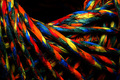
{Blue}by wavelengthComment by timfythetoo: Didnt much care for this one. The colors arent really pleasant and the distorted lines in the backdrop arent enhanced in a good way in the refraction. The shadow lines curling around are pretty much just a distraction and the blackness in the tip is a bit too much. I didnt vote in this challenge but probably would have gone a 4. While the background is blurry it just doesnt do much for the shot. (Hope this isnt too harsh, just figured I would throw a critical comment in along with the other praises). |
| Photographer found comment helpful. |
| 07/01/2006 02:40:48 PM |
Color Coilby wavelengthComment by timfythetoo: I think you got slightly robbed on this one. Great colors and textures. The only thing I can guess is that it may have been a bit too dark on some peoples monitors. I gaveyou a 7 but it was probably a borderline 8 bump up. |
| Photographer found comment helpful. |
Home -
Challenges -
Community -
League -
Photos -
Cameras -
Lenses -
Learn -
Help -
Terms of Use -
Privacy -
Top ^
DPChallenge, and website content and design, Copyright © 2001-2026 Challenging Technologies, LLC.
All digital photo copyrights belong to the photographers and may not be used without permission.
Current Server Time: 06/18/2026 01:58:25 AM EDT.