| Image |
Comment |
| 02/06/2006 07:49:36 AM |
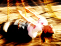
DIZZYby wavelengthComment by Man_Called_Horse: This is not an abstract IMO. It is an long exposure, medium shot.
Definition 1= Art that departs significantly from natural appearances. Forms are modified or changed to varying degrees in order to emphasize certain qualities or content. Recognizable references to original appearances may be slight. The term is also used to describe art that is nonrepresentational.
Definition 2=Not realistic, though the intention is often based on an actual subject, place, or feeling. Pure abstracion can be interpreted as any art in which the depiction of real objects has been entirely discarded and whose aesthetic content is expressed in a formal pattern or structure of shapes, lines and colors. When the representation of real objects is completely absent, such art may be called non-objective.
Comp good, light nice, nice lines, color nice, blacks need work, whites need help, dof ok, Aperature Value needs work, overall just ok pix and not for this challenge |
 Photographer found comment helpful. Photographer found comment helpful. |
| 02/06/2006 03:32:44 AM |
DIZZYby wavelengthComment by LevT: you should have cropped the face out of the frame - it would've been a very nice abstract. otherwise, I don't think it qualifies as such... nice shot, though |
| Photographer found comment helpful. |
| 02/06/2006 03:26:39 AM |
|
| Photographer found comment helpful. |
| 02/06/2006 02:37:33 AM |
|
| Photographer found comment helpful. |
| 02/06/2006 01:06:31 AM |
DIZZYby wavelengthComment by kari1: I am not sure that this really worked for this challenge, but was a good try. Can't wait to have it prove me wrong. |
| 02/05/2006 11:37:57 PM |
|
| Photographer found comment helpful. |
| 02/05/2006 09:38:39 AM |
|
| Photographer found comment helpful. |
| 02/04/2006 09:06:29 PM |
Lagartija en Floreroby wavelengthComment by tanaleefive: Although there is a bright area that normally would be distracting, it does retain detail and adds to the overall image. The color shift from the center out is nice. In addition, the angled pattern in the glass contrasts nicely with the background (hard angles against soft curves bordered by hard curves). The bottom edge of the image seems a bit weak. 9 |
| Photographer found comment helpful. |
| 02/04/2006 08:50:30 PM |
|
| Photographer found comment helpful. |
| 02/03/2006 05:52:15 PM |
|
| Photographer found comment helpful. |
Home -
Challenges -
Community -
League -
Photos -
Cameras -
Lenses -
Learn -
Help -
Terms of Use -
Privacy -
Top ^
DPChallenge, and website content and design, Copyright © 2001-2026 Challenging Technologies, LLC.
All digital photo copyrights belong to the photographers and may not be used without permission.
Current Server Time: 06/11/2026 11:57:18 PM EDT.