| Image |
Comment |
| 01/24/2006 07:22:32 PM |
|
| 01/24/2006 07:01:27 PM |
|
| 01/22/2006 10:52:19 AM |
|
| 01/22/2006 10:08:30 AM |
|
| 01/20/2006 03:08:02 PM |
|
| 01/19/2006 02:41:30 PM |
Swimming in Colourby ZorbaTheGeekComment by Artyste: For your title, the color in this shot is a little lacking. I can see what you were getting at, but the colors don't pop.. and are rather flat for the most part. Lighting is harsh, and the blown out areas on the bird are unflattering. |
| 01/18/2006 01:59:40 PM |
|
 Photographer found comment helpful. Photographer found comment helpful. |
| 01/18/2006 01:16:10 AM |
|
| Photographer found comment helpful. |
| 01/13/2006 09:31:09 AM |
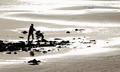
A Walk on The Beachby ZorbaTheGeekComment by Makka: *Greetings from the Critique Club*
I really like this photo. It's strange because it's just so 'opposite'. It was interesting that you cropped it down from a much larger photo. Looking through your portfolio you have some work where you show a great eye for framing and the crop on this, in my opinion, is no exception. The nice rock in the foreground and the pattern of rocks leading to the sea help build the illusion that the person pushing the pram is walking toward the water where actually they are not.
As mentioned in a lot of your comments it's the blown highlights of the sun belting the water which I think cost this photo in votes. It just makes the image look a little bit harsh but at the same time, I could imagine this piece put back in the original photo which may paint a different picture. Maybe a polariser, as mentioned, would of made of a really different looking image?
The focus you have here looks good and the depth of field is great from front to back where you've cropped it from the larger file. The silhouette of the person with the pram is sharp and well placed in the frame.
All in all I liked the photo but it was just those highlights I think that cost you. Congratulations with your score and from looking at your portfolio you're in for a big year. Well done and best of luck!
Neil |
| Photographer found comment helpful. |
| 01/10/2006 10:16:06 PM |
|
Home -
Challenges -
Community -
League -
Photos -
Cameras -
Lenses -
Learn -
Help -
Terms of Use -
Privacy -
Top ^
DPChallenge, and website content and design, Copyright © 2001-2026 Challenging Technologies, LLC.
All digital photo copyrights belong to the photographers and may not be used without permission.
Current Server Time: 07/16/2026 03:42:33 PM EDT.