| Image |
Comment |
| 06/05/2003 11:51:40 AM |
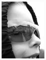
House of the Rising "Son"by orussellComment by carolee: Hello there! Since in the "comments" thread you mentioned that you wished you'd had more constructive comments, I'll leave one of my trademark super-wordy "this is good but that could be better" comments for you. :)
What I liked a lot: the expression on the kid's face, the joy that comes across, made it feel like home SWEET home. The reflection is really clean. It definitely meets the topic. Oh, and the use of the hood was good for framing the image and directing the eye inward.
What I liked less: the upper right is SO white it feels harsh, and because it blends into the border there's no contrast up there. The sunglasses, while I understand the necessity for using them to capture a large enough reflection, are too big for his face and that distracted me for a second. The cropping would have been improved, I think, by going a BIT lower so it didn't look like he was biting the bottom edge of the photo. :) And I might have brought the right edge in a little to minimize the stark white. Finally, I'm personally not fond of portraits of people I don't know, but that's my own prejudice and has nothing whatsoever to do with the quality of your photo.
So there you have it. :) I gave this photo a 6, which is my "meets the challenge and has nothing particularly negative about it but doesn't leap ahead of the pack for me either" score. Hope that helps! |
 Photographer found comment helpful. Photographer found comment helpful. |
| 06/05/2003 07:50:35 AM |
|
| Photographer found comment helpful. |
| 06/04/2003 02:38:18 PM |
|
| Photographer found comment helpful. |
| 06/04/2003 09:20:51 AM |
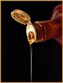
Liquid Goldby orussellComment by e301: Lighting is good - though could perhaps have been a little more even and then you wouldn't have had to slightly over=expose for the bottle top. The extra drip on the neck and the mess in the open top seem a little out of place in such an otherwise clean shot. |
| Photographer found comment helpful. |
| 06/04/2003 12:57:15 AM |
|
| Photographer found comment helpful. |
| 06/03/2003 11:42:40 PM |
|
| Photographer found comment helpful. |
| 06/03/2003 01:50:52 PM |
|
| Photographer found comment helpful. |
| 06/03/2003 01:06:06 PM |
|
| Photographer found comment helpful. |
| 06/03/2003 11:24:03 AM |
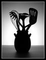
Silouette des ustensilesby orussellComment by orussell: Originally posted by inspzil:
O - I admit I'm one of the ones who marked down for originality in this challenge. I think if you could've done something a little different with the lighting on this one, It would've helped. And its not at all because I think the lighting is bad on this one, just maybe not had it the same across the whole picture. I picture this in my head with the bright light in the middle and substantially darker on both sides, like putting some kind of "v" directly behind the vase so that the light on both sides of it was diverted, so it wasn't quite so intense. Maybe if you could've made it where it looked like the light was coming OUT of the vase it would've done more for me. Just thoughts though. Its really a solid picture as is. Bob |
Bob,
These are the kinds of comments that make a photographer strive for something better.
Thanx,
Owen |
| 06/03/2003 06:48:21 AM |
House of the Rising "Son"by orussellComment by Imagineer: Very nice tones, though I think cropping could have been improved to get in tighter (through middle of nose) to enhance the abstract nature of the shot. |
| Photographer found comment helpful. |
Home -
Challenges -
Community -
League -
Photos -
Cameras -
Lenses -
Learn -
Help -
Terms of Use -
Privacy -
Top ^
DPChallenge, and website content and design, Copyright © 2001-2026 Challenging Technologies, LLC.
All digital photo copyrights belong to the photographers and may not be used without permission.
Current Server Time: 07/16/2026 05:07:15 AM EDT.