Rose6899by
angela_packardComment by karmat: CRITIQUE CLUB CRITIQUE
by karmat
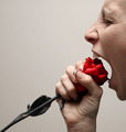
Okay, if I can stop laughing long enough, I'll tell you what I think of this picture.
Compositionally, this is an excellent set up. The stem of the rose leads the viewer's eyes up and into the frame, where they are met with the face. The crop of the head is very effective, I think, for adding to the "tension" in the shot and driving the focus to the mouth and rose.
Technically, the focus and lighting is good, and the exposure is good as well. The red of the rose is very nice, but the gray stem kind of bothers me. I didn't notice it at first, but the more I look at it, the more I notice it. Also, and this is just a nitpick, the pattern on your nails distracts me from the subject. Not enough that if I were voting, I would vote it down, but I find myself looking at them. Probably because they are in close proximation to the rose.
Someone mentioned a different color background. I had not thought of it, but it would be interesting to see what it would look like with a white white backgroun (now, it is a grayish color) or a black one. It might have even been interesting to do it with a "wild" color. If you don't have gels for your lighting (and most of us don't), I have found that the plastic report covers that you can find in school supplies work okay. Of course, it would have cast a different color on the face and rose, so you would have had to had a separate light (with the color) shining on the wall.
It meets the challenge, and I think it is quite funny.
Good work and best wishes in future challenges.
karmat