| Image |
Comment |
| 09/29/2008 10:55:23 PM |
Portrait 07by KenComment by K3Master: I'm thinking a crop that includes a little less of the shoulder/torso?
I'd like to point you to your portrait "Those Eyes", to give you an idea of what can boost a portrait of this nature sometimes, and that's engagement with the photographer. Like Karmat says, she looks a little discontent here, or at the very least, distant. If you can find a way to engage your subject so that they can project at least a little personality, you are far better off. There are times when you certainly want that dreamy, far-off type look, but in this case it just looks like she's had enough and wants you to move on. |
 Photographer found comment helpful. Photographer found comment helpful. |
| 09/29/2008 04:58:44 PM |
Portrait-01.jpgby KenComment by BarbB: Very cute! I like that you just see a little of her eyes, as it draws my eye back into the image, and holds my attention. Nice processing. |
| Photographer found comment helpful. |
| 09/29/2008 10:38:17 AM |
Portrait 07by KenComment by karmat: Nice eyes.
She looks a little discontent -- or like she is thinking, "Go ahead and take the stinking picture."
The spokes out of her head are a bit distracting. Almost a statue of liberty look.
I like the lighting though -- very even and not too bright. I don't see a "light blob" on her head. |
| Photographer found comment helpful. |
| 09/29/2008 10:17:09 AM |
Portrait 07by KenComment by Kelli: This is adorable! She reminds me of a little pixy. Colors are great, eyes are great. My only nitpik might be all the spokes growing out of her, lol. |
| Photographer found comment helpful. |
| 09/29/2008 09:47:27 AM |
|
| Photographer found comment helpful. |
| 09/28/2008 12:55:23 PM |
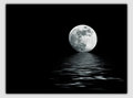
Day 18 - Moon Riverby KenComment by Alicia: That's so pretty, Ken. I've never seen it before. Wonderful process - this would make a kicking print. |
| Photographer found comment helpful. |
| 09/28/2008 01:07:28 AM |
Portrait 05 - Cartesia IIIby KenComment by MattO: I dont know, I think K10guy may be off his rocker, this actually looks to have a hint of butterfly lighting to it. I wish she was more at a 45 to the camera with her body(since you were going for classic pose) and then have her head tilted a bit more. I love her eyes, they will cause you some big problems when she gets older with the boys. The 70-200 works very well on the 5D and 1DMKIII for portraits, but it was always a bit long on any 1.6 crop body I had. I'd buy this if it were my daughter. Of course I'd also lock her in the closet for the next........oh 50 years! |
| Photographer found comment helpful. |
| 09/27/2008 01:16:52 AM |
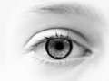
Week 34 - Eyeby KenComment by salmiakki: I like the high key effect of this. Thanks for posting the editing steps, it's always interesting. Reminds me I should do that more often. |
| Photographer found comment helpful. |
| 09/27/2008 12:27:57 AM |
Portrait 04 - Taylor Againby KenComment by bvy: Great lighting indeed. Her eyes complement her red outfit beautifully, and that effect would have been lost on a colored or busier background. Without the tilt, I think some of the linear features here (her long hair, collar and wide glasses) would have been lost. |
| Photographer found comment helpful. |
| 09/27/2008 12:16:53 AM |
Portrait 05 - Cartesia IIIby KenComment by bvy: Hard to compete with  K10DGuy K10DGuy's technical critique; he certainly knows his stuff. I like the high key approach and the bright but soft colors you got out of this. Her flyaway hair contrasts nicely with that background. |
| Photographer found comment helpful. |
Home -
Challenges -
Community -
League -
Photos -
Cameras -
Lenses -
Learn -
Help -
Terms of Use -
Privacy -
Top ^
DPChallenge, and website content and design, Copyright © 2001-2026 Challenging Technologies, LLC.
All digital photo copyrights belong to the photographers and may not be used without permission.
Current Server Time: 06/21/2026 01:30:56 PM EDT.