| Image |
Comment |
| 05/24/2006 04:42:59 AM |
A Winner?by GunnsiComment by yanko: Greetings from CTP2
Technicals:
The lighting didn't come out well but you did do a good job of minimizing the hot spots. As for the color it looks a bit dull to me. Maybe some photoshoping with the levels could have helped that a bit.
Subject/composition:
Good idea for the subject. However, it wasn't immediatley obvious to me due to the crop and the translucent board. I think this might have been one of those occassions where a view from the top would have been better.
Suggestions for Improvement:
Hard to provide much here really. Honestly I think I would have just shot something else with more features rather than those translucent elements which seem like a nightmare to light. However, if you are going to shoot that try that above angle that I mentioned earlier. If anything it would make the idea easier to see in the image. |
 Photographer found comment helpful. Photographer found comment helpful. |
| 05/23/2006 07:49:16 PM |
|
| Photographer found comment helpful. |
| 05/23/2006 06:14:23 PM |
|
| Photographer found comment helpful. |
| 05/23/2006 08:16:10 AM |
il musicistaby GunnsiComment by Oddfrog: Hi from CP2
The colours are bright and the composition and lighting are good.
The lighting does seem a bit harsh... |
| Photographer found comment helpful. |
| 05/23/2006 07:24:31 AM |
|
| Photographer found comment helpful. |
| 05/23/2006 07:04:54 AM |
|
| Photographer found comment helpful. |
| 05/22/2006 10:22:30 PM |
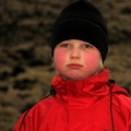
il musicistaby GunnsiComment by yanko: Greetings from CTP2
Technicals:
The lighting is good but it feels a bit intense because of her squinting. The color and detail are good but her face could be sharper. With the amount of light you had available you should have shot this with a much smaller aperture, which would have helped produce a sharper image of her face.
Subject/composition:
I like the choice in subject with her instrument and medal included. The composition is also good. There's some space around her yet she isn't in the center, which I like. The background isn't distracting or anything like that but there is some detail there but that detail doesn't tell me anything more about her. In other words I think maybe something with less features should have been used or a background that in some way told us more about her or her music. Unless of course she's a street performer! In which case scratch the background comment. :P
Verdict/Summary:
I think if the issues I mentioned were corrected this would have been a 6+ scoring image, IMO. Message edited by author 2006-05-22 22:24:57. |
| Photographer found comment helpful. |
| 05/22/2006 05:32:41 PM |
|
| Photographer found comment helpful. |
| 05/22/2006 01:40:40 PM |
il musicistaby GunnsiComment by alexgarcia: Hello from Álex, of the CTP MkII
First Impression: Congrats to the winner
Composition: Very good composition IMO, with the girl in one of the thids, the accordion down and the free space on the left up. The BG is OK.
Subject: Meets perfectly the challenge. Cute girl, but with too much sun to her, so she cannot have her eyes wide open.
Technical: The light is too strong (maybe midday?) and that creates some technical problems: the colors are a bit washed and need more contrast for me; the shadows are too large up-down in her face. And the focus is a bit off her face, it's more on the instrument.
Improvement: Make the shot sooner or later in the day (if the girl is available, LOL).
Summary: A very good composition a bit scored down for the problems on lighting.
Álex |
| Photographer found comment helpful. |
| 05/22/2006 07:02:18 AM |
|
| Photographer found comment helpful. |
Home -
Challenges -
Community -
League -
Photos -
Cameras -
Lenses -
Learn -
Help -
Terms of Use -
Privacy -
Top ^
DPChallenge, and website content and design, Copyright © 2001-2026 Challenging Technologies, LLC.
All digital photo copyrights belong to the photographers and may not be used without permission.
Current Server Time: 07/21/2026 10:55:27 AM EDT.