| Image |
Comment |
| 04/16/2003 01:10:52 AM |
Come forth to carry me home.by GeocideComment by ScottK: Beautiful color. Just can't decide if you might have come up with a better way to cut out of the massive amounts of darkness at the top and bottom. I guess that tells an important part of the story. |
 Photographer found comment helpful. Photographer found comment helpful. |
| 04/14/2003 11:46:55 PM |
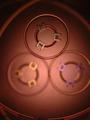
Round Red Ring of Piby GeocideComment by RiderGal: Critique Club
Hi Geocide - I really think the your color entry was much more effectual than this one, even though they were of the same items...
Did you just crop substantially in on a similar photo to the other? That's how it looks to me because of the extreme graininess of the photo. Thats hard to deal with sometimes, but it's something to think about. I think it fit the challenge pretty well... it definitely had the circle in there (which is awesome for pi) and I think it was an interesting shot with multi layers. Lighting isn't bad... and I like the DOF... The colors of the photo are kind of dull... but otherwise it's not really bad, just not extremely appealing to me.
This is a very different photo... somewhat interesting but not my style. We all have our own opinions. Best of luck!
-Talya |
| Photographer found comment helpful. |
| 04/14/2003 03:01:38 PM |
|
| Photographer found comment helpful. |
| 04/14/2003 02:24:11 PM |
|
| Photographer found comment helpful. |
| 04/14/2003 12:51:26 PM |
|
| Photographer found comment helpful. |
| 04/14/2003 11:56:14 AM |
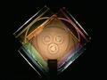
The Magic Wheelby GeocideComment by jmsetzler: Greetings from the Critique Club :)
Hi Geocide...
This is an excellent color shot... I really like the abstract nature of it. It took me a while to figure out what I was looking at translucent and colored CD cases...
I read through all your 'nice job' comments :) No one really wanted to step up to the plate for you on the comments this week...
Compositionally, I think you could have created a higher impact by going with a square frame rather than rectangluar. Why? Because the 'centered' composition can be a little awkward sometimes. I believe that when you have an image such as this one, using a square frame with less empty space on both sides works better. Your image is still centered, but it doesn't really jump up and scream 'centered orientation' when it's in a tighter square area.
Keep up the good work :)
John Setzler
|
| Photographer found comment helpful. |
| 04/14/2003 11:47:16 AM |
|
| Photographer found comment helpful. |
| 04/14/2003 11:33:55 AM |
The Magic Wheelby GeocideComment by BadPigg: Nice job, this in no way deserves a single 1 or any 2's. Those brought your score down. You should have placed higher in my opinion. |
| Photographer found comment helpful. |
| 04/14/2003 04:50:27 AM |
|
| Photographer found comment helpful. |
| 04/14/2003 03:00:25 AM |
|
| Photographer found comment helpful. |
Home -
Challenges -
Community -
League -
Photos -
Cameras -
Lenses -
Learn -
Help -
Terms of Use -
Privacy -
Top ^
DPChallenge, and website content and design, Copyright © 2001-2026 Challenging Technologies, LLC.
All digital photo copyrights belong to the photographers and may not be used without permission.
Current Server Time: 07/16/2026 05:01:58 AM EDT.